
How I Designed a Restful Blue, Grey and Pink Bedroom
Blue is such a versatile colour, so whether you're after a light, serene look or something more bold and dramatic, it's a really popular choice for a bedroom. I’ve already shared the little boy’s room reveal at this Edwardian house in Halifax but today I'm showing you how I used dark blue walls to create a cocooning and inviting master bedroom, and how I used pink and grey accents to soften the look. I'll also be sharing lots of tips on how to make it work in your own home - perfect if you're looking for blue bedroom ideas or need inspiration for bedroom colour schemes.

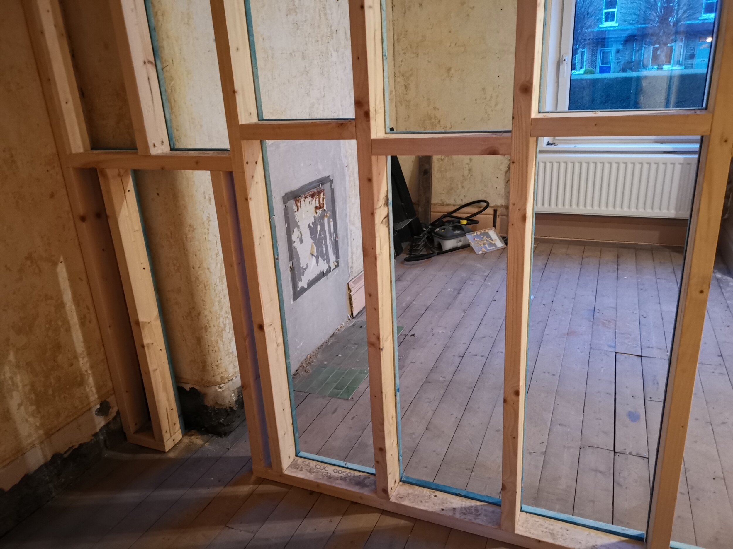
Before
The brief was to create a cosy space with a hint of glam but with a laid-back, thrown together kind of look. Because we’d turned the smallest bedroom into a dressing room, clothes storage wasn’t needed but the clients did want a dedicated space for reading. They’d already bought the Skye grey upholstered bed from Made so this needed to be incorporated into the overall design.
Choose your colour palette
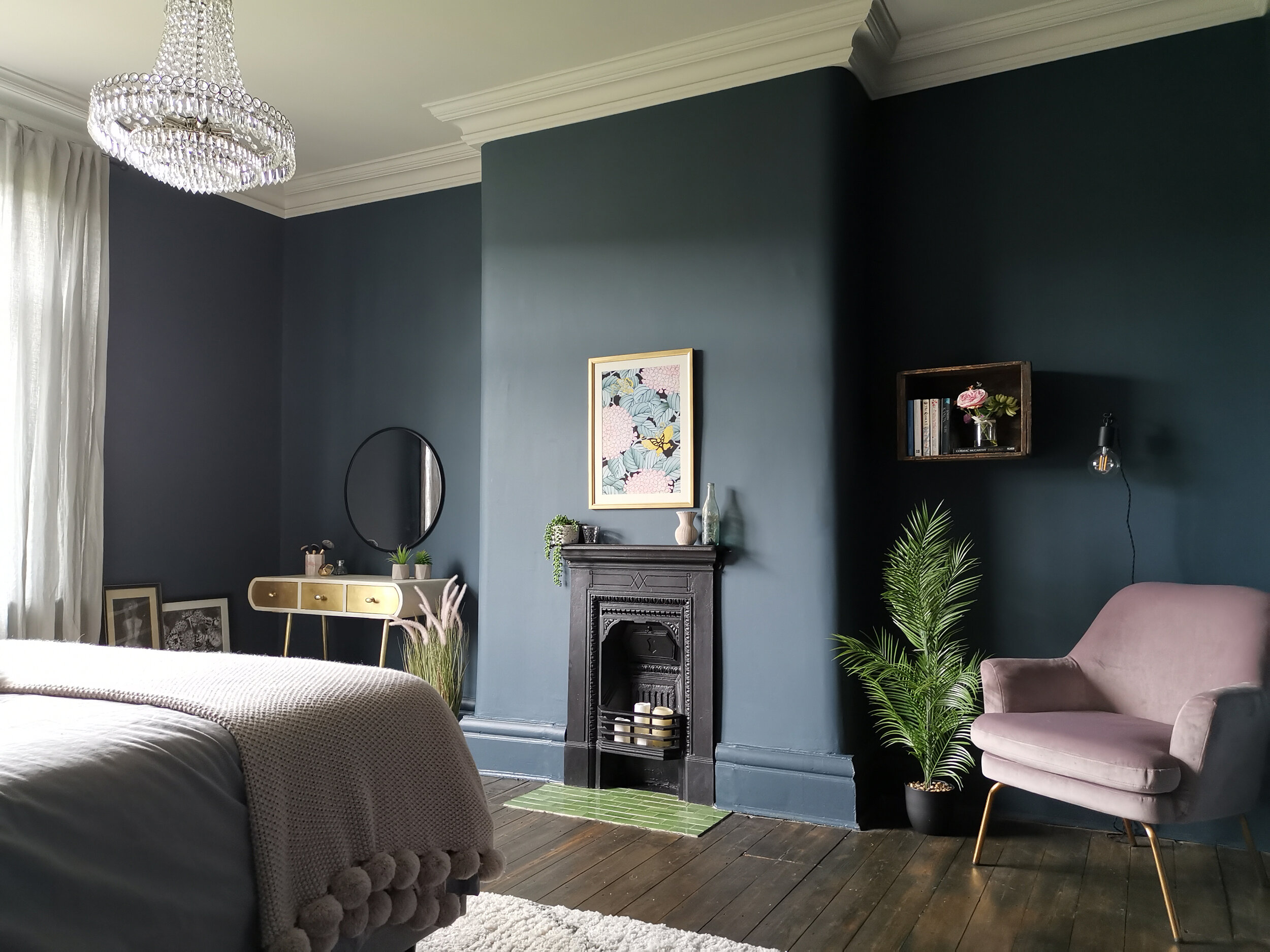
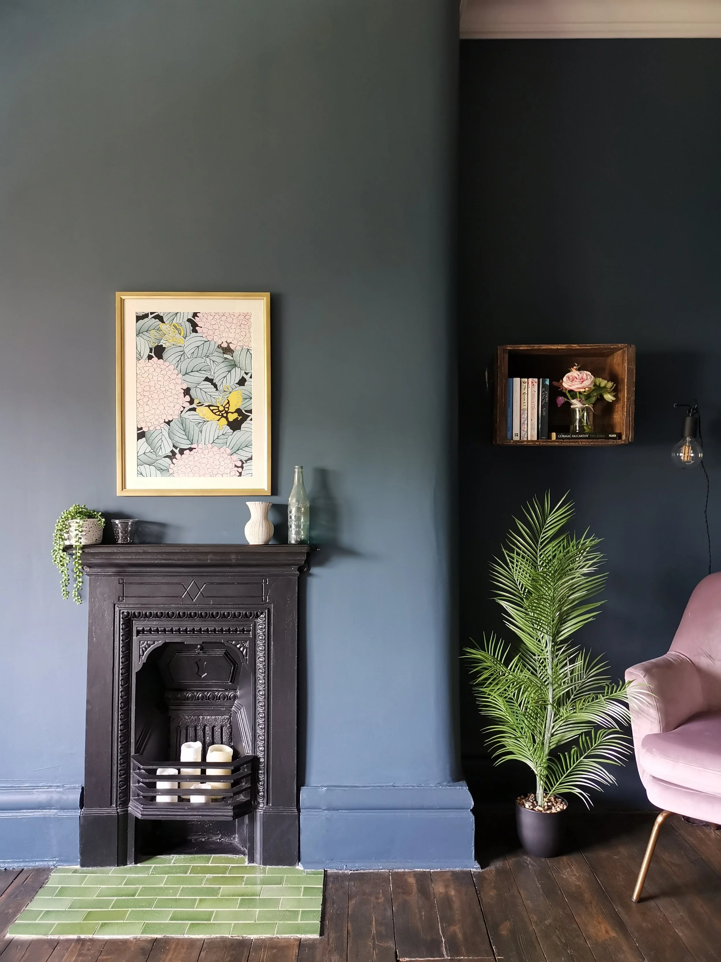
When you're choosing a paint colour, it's really important to consider the orientation of the room. This one is east-facing so it doesn’t get much natural light apart from in the early mornings. Lots of people would choose a neutral colour to try and lighten it up but instead, I often recommend embracing the dark and going with a bold wall colour. The colour scheme here actually started with the beautiful original green hearth tiles that we uncovered. Blue pairs really well with green so we experimented with different shades of blue for the walls. After a bit of gentle persuading, the clients agreed to paint the walls and woodwork in Raven Plume by Dulux - a deep, dramatic blue that doesn’t feel at all teal and goes beautifully with green. Painting walls dark makes a room feel cocooning so it works brilliantly in a bedroom.
We introduced green accessories to link with the hearth tiles and tie everything together, and we chose blush-pink as an accent colour throughout the space for a touch of girly glam. Grey shades are great for softening a room. We complemented the grey tones of the headboard with a grey duvet cover and linen curtains in a light grey shade for a cohesive look. Pink, green and grey are the perfect colours to complement a blue bedroom design.
2. Use wood furniture

Before


Wood tones always add warmth, texture and a natural feel - especially important with cool wall colours. For a relaxed, lived in look, I didn’t want any of the furniture to match. I chose a mid-century style bedside table (just £40 from Jysk!) and sourced an antique Victorian chest of drawers in a similar wood tone for the other side of the bed. Going vintage is a great way to save money - try eBay or Gumtree and see if you can pick up a bargain.
3. Add gold accents

NB. Client would like everyone to know the life drawing is not of her (although if it was me, I think I’d just go with it…..)
Metallic accents make a big difference and I almost always include a bit of gold in a room design. It really helps to lift a space and warm things up. This dressing table is from Atkin and Thyme - see how the gold elements in this corner create a striking contrast against the cool tones of the walls? The vintage suitcase was a wedding present from the client’s friend (used for guests to put their wedding cards in) and leaning the frames against the wall adds to the relaxed vibe. My bargain buy was the Habitat mirror - found for £25 in TK Maxx!
4. Use flooring with warm tones

Whether you choose carpet or hard flooring, make sure that the you choose a warm colour. Darker tones are fine but beiges and browns work better than greys because they provide a contrast with the cool blue of the walls. Reason 431 why I love original floorboards - they don’t have to be perfect! And if you’re happy to restore them yourself, using the original floorboards is a really affordable option.
5. Add accent colours with wall art

Deep blue walls provide the perfect backdrop for well chosen wall art. This client is a great lover of everything Japanese so I sourced the Hydrangeas and Butterflies print from King & Mcgaw which coordinates perfectly with the accent colours we chose for this room. We didn't want really loud, bright colours because we wanted to keep a peaceful feel so I made sure that the colours in the wall art were muted. The chimney breast with its reinstated fireplace and pretty artwork is now the focal point of the room. We added a touch of luxury with the statement chandelier - a great choice if you live in a period home with high ceilings.
The Ensuite

Before
Now moving through to the ensuite - we found an original door on eBay and knocked an opening through that wall.

I really love this colour combination! We tried several bold shades of green before settling on Dulux's Palm Night. The square pink tiles from Topps Tiles carry the accent colour through to the en-suite and add a vintage feel while the traditional style floor tiles give a nod to the house’s history.
Because we created the en-suite from scratch, I was able to make sure it was exactly the right size to fit a walk-in shower at one end and a basin and toilet along this wall.

Guess where the vanity unit and basin are from? Only IKEA!


See how the gold tapware elevates the space?

I made sure to include blue hues in the wall art, carrying the blue colour through from the bedroom for a nice flow.
So there you go! Hope you love it as much as we do. Blue really is an excellent choice for a bedroom. With the right colour combinations, furniture and a few personal touches, you can create a space that feels both unique and restful. I hope these blue bedroom ideas have given you plenty of inspiration for your own transformation. I’d love to know what you think - let me know in the comments!
Read all about the hallway transformation at this house here.
If you’re starting a project and need some help or inspiration, please get in touch. I’m a West Yorkshire based interior designer and I also offer an online design service.