
Interior Trends for 2021: Part 1 - Colours
For part 1 of my blog posts on this year’s trends, I’m focussing on colours. While it’s much more important to choose things because you like them rather than because they’re on trend, it's good to have an idea of what we'll be seeing a lot of this year - plus you might spot something you really love! Unsurprisingly, the events of 2020 have had an impact on many of the paint companies’ colour choices this year.
Warm Neutrals

Image credit: Dulux
Dulux’s colour of the year is Brave Ground - a warm, earthy beige/brown. Dulux describes it as symbolising “stability, growth and potential”. As they do every year, they have provided four colour palette combinations to create different moods - Expressive, Trust, Timeless and Earth. As a lover of all things blue, my favourite is the Earth Colours.

Image credit: Dulux Earth Palette
I love how the cool blues and greens are balanced out by the warm tones of Brave Ground on the shutters (and this is a perfect example of how to avoid interior design mistake #1 - automatically painting the woodwork brilliant white!) The rattan chair adds texture and complements the natural colour tones perfectly. Dark colours work really well in a bedroom or living room if you use it mainly in the evenings. Add lots of texture for a cosy feel.
Little Greene has also embraced warmth this year with its new colour collection, ‘Stone’. It comprises of 36 beautiful shades, from warm neutrals to deeper warm tones, and includes 22 new colours.

Image credit: Little Greene Slaked Lime 105. Light Bronze Green 123. Nether Red 315. Elysian Ground 320. Book Room Green 322
Yellow and Grey

Image credit: Pantone
Because we’ve seen a definite move towards warmer neutrals recently, Pantone’s colour of the year, ‘Ultimate Gray’, came as a bit of a surprise. However, it is combined with ‘Illuminating’ - a bright and happy yellow. Pantone describe their choice as a combination that provides strength and hope - “practical and rock solid but at the same time warming and optimistic” - something we all need this year.
Yellow and grey is a classic mid-century colour combination, which Mini Moderns combine perfectly in many of their collections, including Dungeness, Festival and P.L.U.T.O. - pictured below.
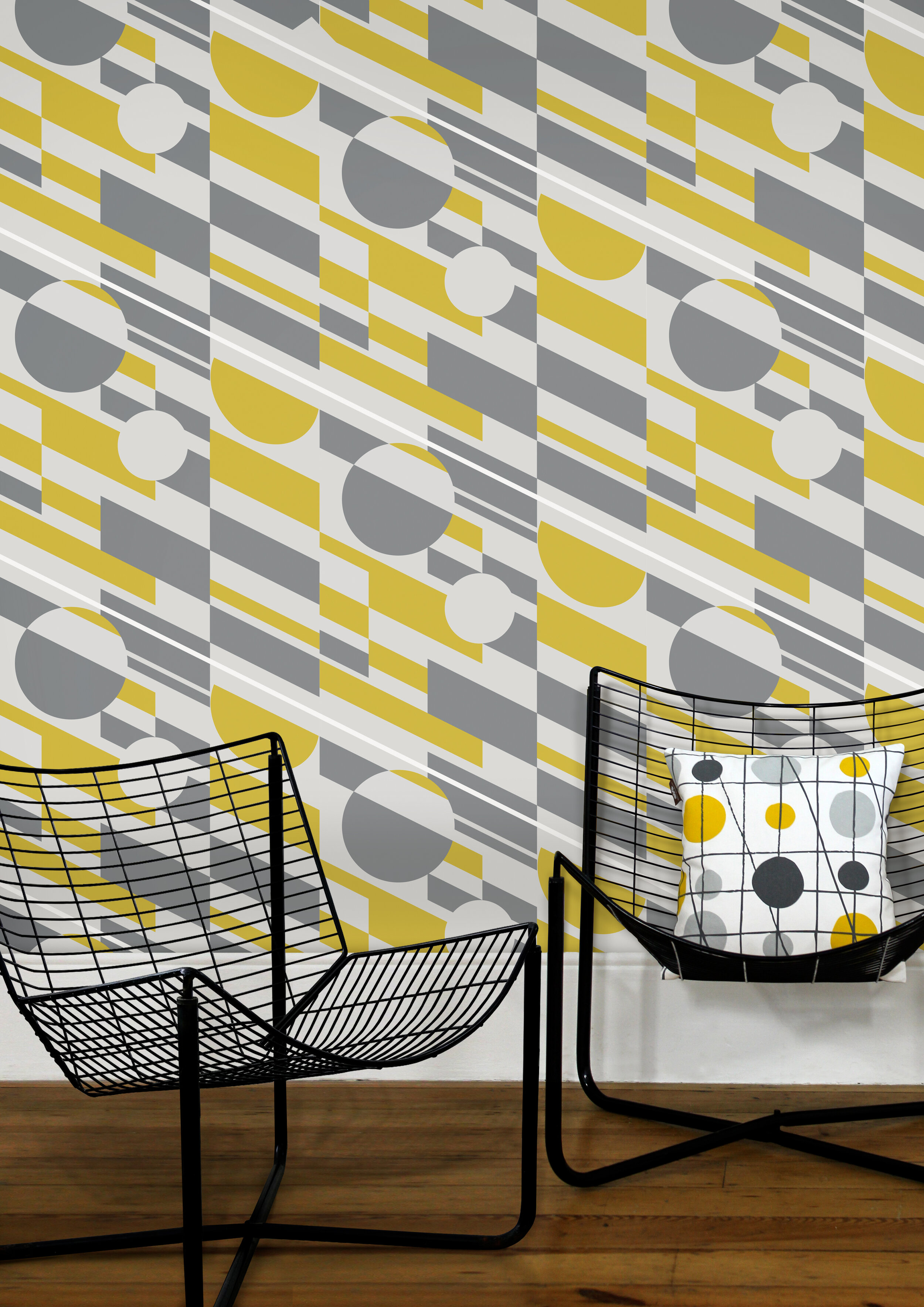
Image credit: Mini Moderns Pluto wallpaper
To make a bold statement, try using these colours in wallpaper and picking them out in the accessories. The more yellow you use, the warmer and brighter the space will feel so if you want to tone it down, use more grey. I love how Mini Moderns have combined their Art Room wallpaper here with a painted floor in Farrow and Ball’s Manor House Gray. Pale wood tones complement the combination perfectly.

Image credit: Mini Moderns Art Room wallpaper (if you love this colour scheme, pop over to Mini Moderns’ Instagram highlights - they did a great feature on it a couple of weeks ago!)
For a more subtle scheme, use grey on large pieces of furniture, such as sofas, and add hits of yellow in the accessories.
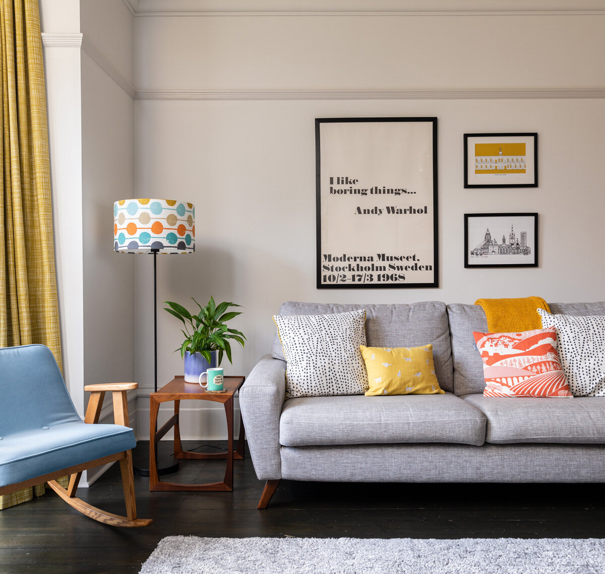
No Space Like Home Living room, combining grey rug and sofa with yellow accents.
Be careful if you’re using yellow in a south-facing room, like the room above. The walls here are actually painted in Farrow and Ball’s Strong White but look a lot warmer. The warm light streaming through could make too much yellow feel a little overbearing so include more grey to balance it out.
Or why not include a fun pop of yellow on a radiator?!

Image credit: Vintage Cast Iron Radiators
Sea Colours

Image credit : Benjamin Moore Aegean Teal
With so many missed holidays in 2020, it’s no surprise that we want to welcome some soothing sea colours into our homes. Benjamin Moore describes their colour of the year, Aegean Teal, as “Intriguing, balanced, and deeply soothing” - I love it!
Teal is such a liveable colour - calming and relaxing without the coolness of some blues. Use on walls with a coordinating warm white on woodwork. For a more subtle scheme, keep walls neutral and add teal accents. Because they’re opposite each other on the colour wheel, teal and orange work brilliantly together.

No Space Like Home Dining room, incorporating orange and teal hues. Walls are in Little Greene’s French Grey Mid with woodwork in French Grey Pale
Greens

No Space Like Home En-suite bathroom at the Edwardian Terrace project, with walls in Dulux Palm Night
As we’ve been stuck indoors for most of the last year, we’re increasingly using the colour of nature to bring the outside in. From cocooning dark shades to lighter variations, green is a naturally uplifting colour.
Brunswick Green features in Little Greene’s new stone collection and is a perfect colour to use in a utility/boot room, especially when combined with a terracotta floor.
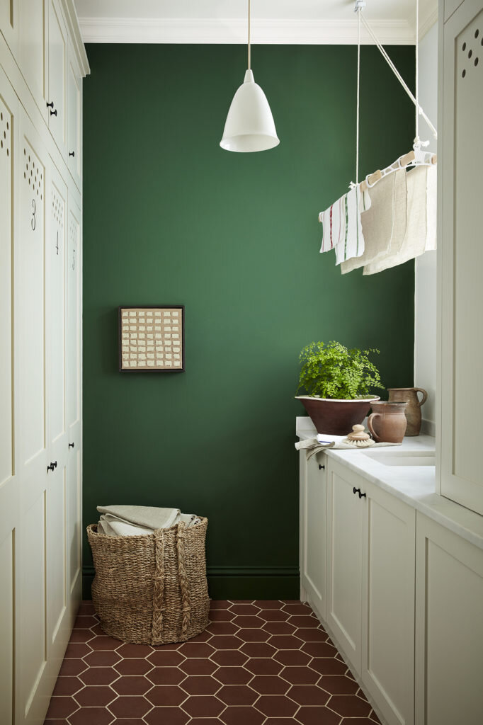
Image credit: Brunswick Green by Little Greene
If you’re a little nervous about being bold with colour, try going dark in small rooms which aren’t used as often, such as a cloakroom or a hallway.

No Space Like Home Cloakroom with woodwork and ceiling in Little Greene’s Pique and walls in Jewel Beetle - a dark, bright and lively green.

No Space Like Home Edwardian Terrace Hallway with walls in Little Greene’s Windmill Lane and woodwork in Obsidian Green.
So what do you think? Seen anything you love? Let me know in the comments! I also offer a colour consultation service (including a remote service) so if you need any help with choosing the perfect colours for your space, please get in touch!
