
Edwardian Terrace Kitchen - Final Reveal
Last year, I worked on the kitchen design of a two bedroomed Edwardian terrace in Halifax. I finally got in to do the styling last week so I’m excited to share the final reveal with you!
Before

The whole space was very woody - wood effect floor, wood wall units, wood base units and all the same tone. Although I do like to add some wood to every room, this was way too much! It felt very enclosed. And no colour!

And look at the base units in front of the window 😩

This was the view looking out of the kitchen towards the dining room (during the clear-out phase).
The Interior Design Scheme

Although the room is south facing, it doesn’t get loads of natural light because it backs on to a wooded area with lots of trees. We decided on a colour scheme of warm pale pink and mint green, softened with light grey tones and with black accents to ground the space. The client likes copper accessories but I recommended mixing in some gold tones too - they always lift a scheme and I almost always include a bit of gold in a room. Because gold and copper are both warm metals, it’s easy to mix them.
The New Layout
Here’s one of the initial 2D plans I created.

The main change we made to the layout was to get rid of the wall units along the oven wall. I’m not a massive fan of too many wall units - they can make a space feel really enclosed. Instead, I recommended having open shelving either side of the extractor.

The wall units the other side had to stay because they house the boiler. I always create 3D models for kitchen designs - it’s so important for clients to be able to visualise how the space will work. The client had already decided which brand of kitchen she wanted because she’d had one in a previous house and found the quality to be really good for the price. We chose the Zola Soft-Matte in Dust Grey.
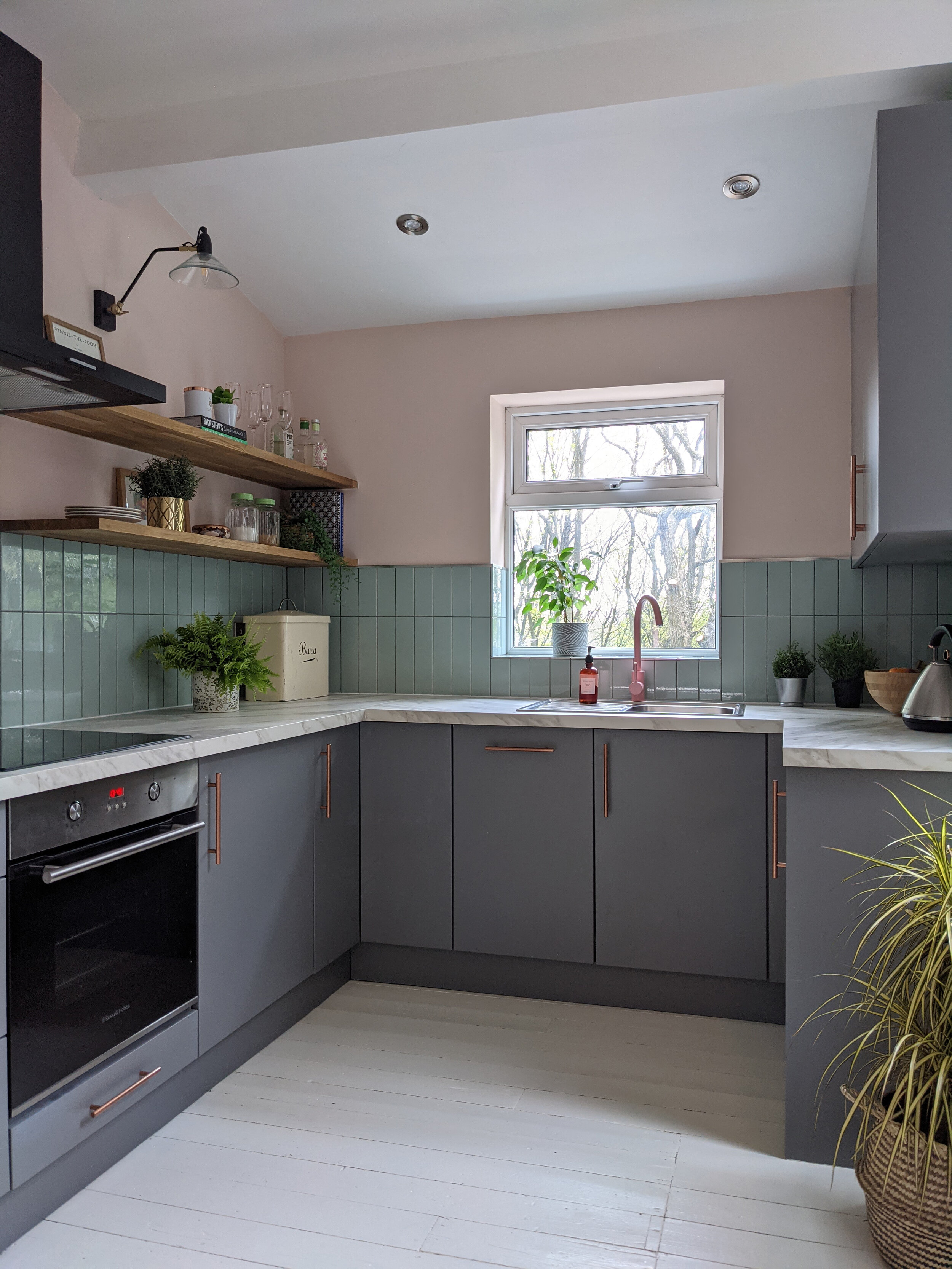
After
Here it is now!

It feels so much lighter and brighter! Biggest tip for lightening up a space - have the floor in a light colour. It will bounce the light around the room. The walls are painted in Pink Ground by Farrow and Ball. It looks warmer and peachier on a sunny day.

We introduced wood tones in the shelves and we’ve added interest by displaying plants and vintage finds. The wall lights from La Redoute provide all-important task lighting for the worktop. We made a little amendment to the tiling design so instead of tiling up to the top shelf all the way along, we stopped at the bottom one.

The lovely spoons and the apple pot are by @peepandco.

The client found the vintage Welsh bread bin on eBay…I love it!

The beautiful mint green tiles are from Mandarin Stone. We laid them vertically for a more contemporary feel (and because horizontally they reminded the client of an Excel spreadsheet - not something one would want to be reminded of while making one’s tea, or indeed at anytime).

Look at the beautiful tap! It’s the Tinkisso from Dowsing and Reynolds and I’m a bit obsessed with it.

Although I haven’t had much to do with the decor in the adjoining dining room, I did do a colour consultation for it. The client rang me in distress because she’d had a decorator paint the dining room the same pink colour as the kitchen but it looked awful so she chose another shade of pink and painted it all again but apparently it looked like an ice cream. On paper, south-facing rooms can take most colours but in this one the pink just didn’t work because the trees were absorbing a lot of the natural light - it did indeed look like a strawberry ice cream. That’s why you should ALWAYS TRY TESTERS ON BIG PIECES OF PAPER in different locations in the space. Imagine how much money she would’ve saved in paint and decorator costs if she’d got it right first time. We decided to ditch the pink and carry the mint green from the kitchen tiles through to the dining room walls. (Note to client: Radiator could do with painting the same colour as the walls 😀) Read my blog post for more advice on how to choose paint colours for your home.

We chose Aquamarine Light by Little Greene - a really refreshing shade.

Hope you like it - let me know what you think in the comments.
I’m a Halifax based interior designer and I cover surrounding areas, including Leeds and Manchester. I also provide a remote interior design service. If you’re starting a project and need some help or inspiration, please get in touch.
PIN FOR LATER
