
How to choose paint colours

Do you find it difficult to choose colours for your home? Lots of people do! Not surprising that people feel a little overwhelmed when there are so many brands and paint colour choices out there. Should you go dark or light, or maybe mid? A warm colour or a cool one? In this blog post, I’m looking at the different things you should consider when choosing the right paint colour for your space.
1. Which colours do you actually like?

Think about which colours you’re naturally drawn to. Look through a magazine – do cool colours or warm ones jump out at you? If you have any Pinterest boards, which colours are appearing often in the pins you’ve saved? Another trick is to take a look inside your wardrobe. Which colours do you see? The colours you choose to wear are a good indication of the ones you like. Translate this into your interiors!
2. How do different colours make you feel?
When we think of different colours, they conjure up certain associations for us - each colour has negative and positive traits. For example red is love, power and aggression; blue is calm, soothing and cold. Psychologist Angela Wright did a study into colour psychology in the ‘80s when she identified four colour palettes (morninglight, dreamlight, firelight and starlight) and discovered that each of the four personality types has a natural affinity with the positive traits of one of those colour palettes. Her theory has inspired the work of many others, including colour guru Sophie Robinson. So it’s really important to remember that colour choices are very personal and the way you feel about a certain colour might be very different to someone else’s opinion of it.

In our little boy’s room, we painted the entire room (walls, woodwork and ceiling) in Blackened and the floor in Lulworth Blue, Cook’s Blue and Borrowed Light by Farrow and Ball.
I love blue. I find it so calming and I’ve used it throughout my home. My sister, on the other hand, finds it cold and she loves yellow. She’s even painted her bedroom bright yellow because she thinks it’s peaceful. I see yellow as a vibrant, lively colour so I’d never paint my bedroom in it - I have enough trouble sleeping already, throw in a yellow bedroom and I’d have no chance. So, while each colour has positive and negative associations, think about the kind of mood you want to create in your space and how each colour makes you feel.
3. The colour wheel - which colours go together?

It’s really important to consider the combination of colours so that you have a cohesive colour scheme, not just for a single room but for a whole house. Always consider sight-lines. For example, if you can see from your hallway into your lounge and your dining room, you’ll need to make sure that the colour palettes in all those rooms work well together.

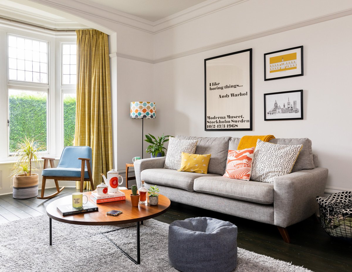
In our hallway, see how the orange in the framed artwork is echoed in the lounge sofa and the blue on the walls is carried through to the dining room blinds? Orange and blue sit opposite each other on the colour wheel so they work well together. Colour theory can be used to identify different types of colour schemes.
Complementary
Complementary colours sit opposite each other on the colour wheel. These types of colour schemes work best if you let one of the colours do the talking and introduce the other as accents. It would feel too much if you gave equal weight to each.


In our utility room, we’ve used green on all woodwork and painted the bench red. It works because green is the dominant colour and red is the accent.
Monochromatic
Monochromatic colour schemes use only one colour but vary the tint (by adding white), shade (by adding black), or tone (by adding black and white). Using texture is a great way of adding interest to a room with a monochromatic colour scheme.

We used a blue monochromatic paint scheme on our landing. The walls are painted in Juniper Ash and the woodwork and floor are in the darker Basalt by Little Greene while the stairs leading to the second floor are in a lighter shade of blue.
Harmonious
Harmonious colours sit next to each other on the colour wheel. This type of scheme works well if you use both colours in a similar tone so that one isn’t dominated by the other.

In our Edwardian terrace project, we used dark blue in the bedroom leading to dark green in the en-suite. Because both colours are of a similar tone, there’s a nice balance.
Triadic
Triadic colour schemes use colours that are equally spaced in the colour wheel, for example yellow, red and blue.
Split complementary
This is one of my favourites! Split complementary schemes use two colours next door but one to each other, plus the colour opposite, such as blue, green and red-orange.

In the baby boy’s room at the Edwardian terrace project, we used blue as the main colour in the little boy’s room, painted the shelves in green and then added splashes of orange and red-orange in the accessories, such as the wall prints.
4. Don’t forget the natural light!
This is the biggest factor that determines how your eye sees a colour. Have you ever seen a paint colour in a magazine or on Instagram, painted your room in it and to your horror, it looks absolutely awful? Paint colours look so different in different rooms because the orientation of a room has a massive impact on how a colour appears in a space. A paint colour will look very different, for example, in a north-facing room compared with a south-facing one and it’s all to do with natural light. Here’s a quick guide to how the direction of your room impacts how your eye sees colour.
South facing
These are the easiest rooms to decorate! They get a lot of natural light with a lovely warm glow throughout the day and there’s lots of shadow to make things interesting. Colours look most like themselves in south-facing rooms and almost anything goes. The only thing I’d advise against is painting it yellow. It would feel too dazzling, you couldn’t relax and on a sunny day, you might be blinded. By all means, introduce yellow in the accessories.
Our south-facing lounge is painted in Strong White by Farrow and Ball, with woodwork highlighted in Ammonite. In a north-facing room, these colours would look much cooler.
North facing
Because these are the most difficult spaces to get right , I have written a separate blog post where I share the best paint colours for north facing rooms.
North facing rooms are tricky customers. The light coming through has a bluish tinge so colours look much cooler. One of the most common mistakes I see is people assuming that painting a north-facing room brilliant white is the way to go - it can often end up a cold, bland and uninviting space because there’s no light and shade to bring things to life. In a north-facing room, a great option is to stop fighting it and embrace the dark with a bold colour. If you’d rather go with neutral colours, choose a white that has a yellow base, such as Wimborne White by Farrow and Ball or Benjamin Moore’s Chantilly Lace. Warm things up by adding splashes of bright colour in the accessories.

My tween boy’s north-facing room with white walls painted in Swiss Coffee by Benjamin Moore - a subtly warm shade. We added brights in the colour blocking and accessories.
Same with greys – choose a warm grey rather than a blue-based grey which could end up feeling very cold.
And to demonstrate how different a paint colour can look depending on the natural light, take a look at these two pictures, both featuring shades from Little Greene’s French Grey colour family.

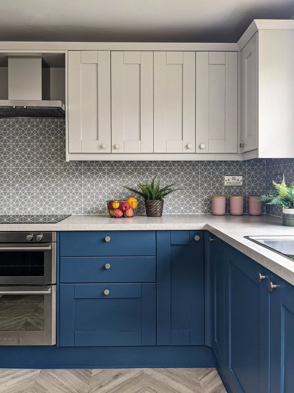
Our north-facing kitchen, with walls painted in French Grey Mid
The North Wales kitchen with south and east facing windows - the wall units are painted in Little Greene’s French Grey - a slightly darker shade than French Grey Mid
Can you see the difference in colour?!! The north-facing light in my kitchen makes it look much cooler while the south-facing light in the North Wales kitchen gives a much warmer feel. If I’d gone for a cool grey in my kitchen, it would’ve felt too cold and blue.
East and West facing
These are also very tricky because the light looks different at different times of day. An east-facing room gets warm light in the morning which gradually decreases. West-facing rooms are the opposite - cool light in the mornings with a warm evening light. Take a look at my new blog post with the best paint shades for an east facing space.
The main school of thought is that you should embrace the cool in east-facing rooms (think blues and greens) and embrace the warmth (pink is enhanced by the early evening light) in west facing rooms but I don’t think it’s as simple as that. There’s no point painting a west-facing room in a warm pink if you hate warm colours. You really need to think about what time of day you’ll be using the room, the mood you want to create and again how each colour makes you feel. If you have an east facing room that you mainly use in the mornings, do you want to balance the warm light by choosing a cooler colour or enhance it with a warm colour? Same with a west-facing room that you use mainly in the evening. Take a look at my Scandi Lagom Living Room project which has lovely west facing light.
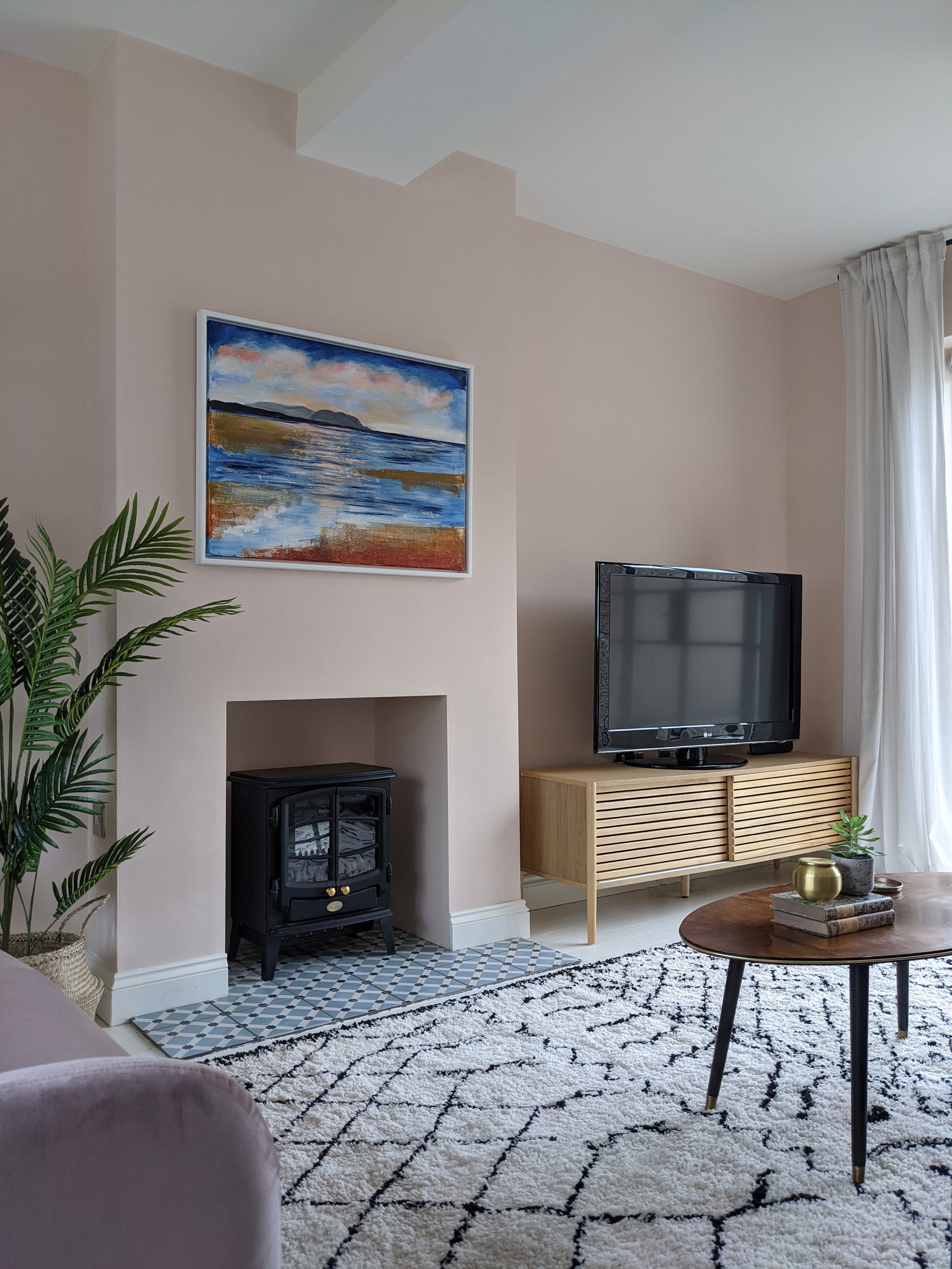
The lounge in the North Wales coastal home has both east and west facing windows (just to confuse things!) It has lovely warm light in the morning and late afternoon. It’s painted in Farrow and Ball’s Pink Ground and it definitely looks warmer and peachier at these times, especially on a sunny day.
Just bear in mind that if you choose a cool colour in a room that you use at all times of day, it might look a bit cold at certain times - in this case, going for a stronger colour with less grey in it will help. If you like blue, choosing a shade with some green mixed in will also help it to look less cold - try Aquamarine Mid by Little Greene or Farrow and Ball’s Teresa’s Green. Similarly, if you choose a warm colour such as pink, it might look more peachy at certain times of day. Have a play around with different shades until you find the right colour and check how it looks in artificial light. If you need to warm things up, opting for warm-white lightbulbs will make a big difference.
East-facing bedrooms and living rooms that are used mainly in the afternoons and evenings work well if you embrace the lack of natural light and go dark on walls for a cocooning feel.
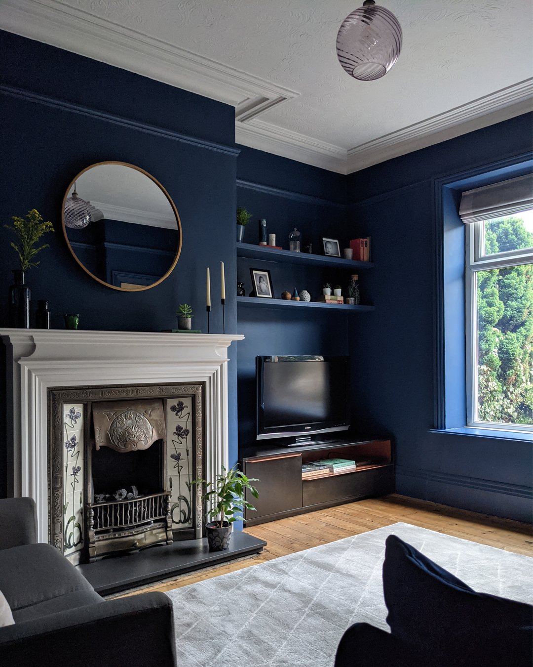
The east-facing lounge in the Victorian terrace project is painted in Little Green’s Hicks Blue - it’s mainly used by the family in the afternoon and evenings. It feels especially dark in here because the houses opposite block a lot of the light. Previously painted in a light colour, it felt very flat but now it feels nice and cosy with its blue walls. A good tip for small spaces is to paint the walls and woodwork the same colour as each other to help make the room feel bigger.
I know I’m always harping on about this but the biggest tip I can give is to ALWAYS try paint samples on big pieces of paper in the space (at least A3 size). It's the best way to see what a colour really looks like in the space, rather than just using paint chips. Even following the advice for each orientation doesn’t work in every room because other things (such as whether there’s anything outside the window absorbing the light), can have an impact on colours. And bear in mind that when the whole wall is painted, the colour will appear a bit lighter than it does on a sample.
5. Remember the ceiling and woodwork
One of the biggest design mistakes I see is automatically painting the ceiling and woodwork brilliant white. Because this creates a big contrast with the wall colour, your eye doesn’t know where to rest and it can make the room feel disjointed. Instead, pick a tonal white - most paint brands tell you the coordinating white for each of their colours. Alternatively, painting the woodwork the same colour as the walls will create a more seamless feel and will make a small room feel bigger. See how we painted the walls and woodwork the same colour in our dark green Georgian living room design. For a more dramatic look, paint the woodwork darker than the walls - this works particularly well if you have lovely deep skirting boards or nice detailing on the woodwork that you want to highlight. Going dark on the ceiling as well as the walls is a great way of creating a more cocooning feel in a bedroom.

East-facing hallway at the Edwardian terrace, painted in Little Greene’s Windmill Lane with the darker Obsidian Green on woodwork. Choosing bold paint colours for a hallway creates a dramatic entrance and makes the rooms coming off it appear lighter.
6. Think about what else is in the room
And finally, it’s really important to think about what’s going to be in the room. Don’t think of paint colours in isolation - take into account everything that will be in the space such as fabric, furniture and accessories. For example, furniture in warm wood tones such as oak can really help to warm up a cool colour scheme and gold accents will give a room an instant lift.
So there you go! I really hope you’ve found it useful - let me know in the comments. And why not take a look at my new blog post on paint colour trends for 2025?!
If you’re still struggling with choosing the best paint colour for your space, I offer remote design services and on-site consultations in West Yorkshire - do get in touch!

