Interior Paint Colour Trends for 2026

Image credit: Benjamin Moore
Happy new year! I'm starting this year's blog with a look at the paint colour trends for 2026. I definitely saw a shift last year in the colour preferences of my interior design clients towards warmer, earthier tones, although blues and greens remain really popular choices.
While I never recommend choosing colours based only on trends - it's much more important to think about which colours you're naturally drawn to - they can definitely help to provide inspiration and fresh ideas.
The leading paint companies' selections for the coming year include dark and light hues from across the colour spectrum so there’s something for everyone, whether you’re after an uplifting, light-filled space or a moody, cocooning interior. Let's take a look!
Deep reds and purples
Rich colours are a great choice if you want to make a room feel cosy. Bold reds like burgundy became really popular last year - expect to see a lot more of them in 2026.
Image credit: Graham and Brown - Divine Damson paint
Graham & Brown's colour of the year, Divine Damson, combines deep purple with dark red tones and is described as an opulent shade that is "inspired by the lush tones of ripe damson and fig". It changes dramatically in different lights and creates a cosy and characterful space. In colour psychology, red is associated with appetite stimulation, making this shade particularly well suited to dining rooms, where candlelight can enhance its depth and create an intimate, atmospheric space.
Image credit: Graham and Brown - Eternal Weave Black wallpaper and Divine Damson Paint
Their design of the year, Eternal Weave, is the perfect option if you’re looking for a complementary wallpaper or fabric. It comes in six different colourways.
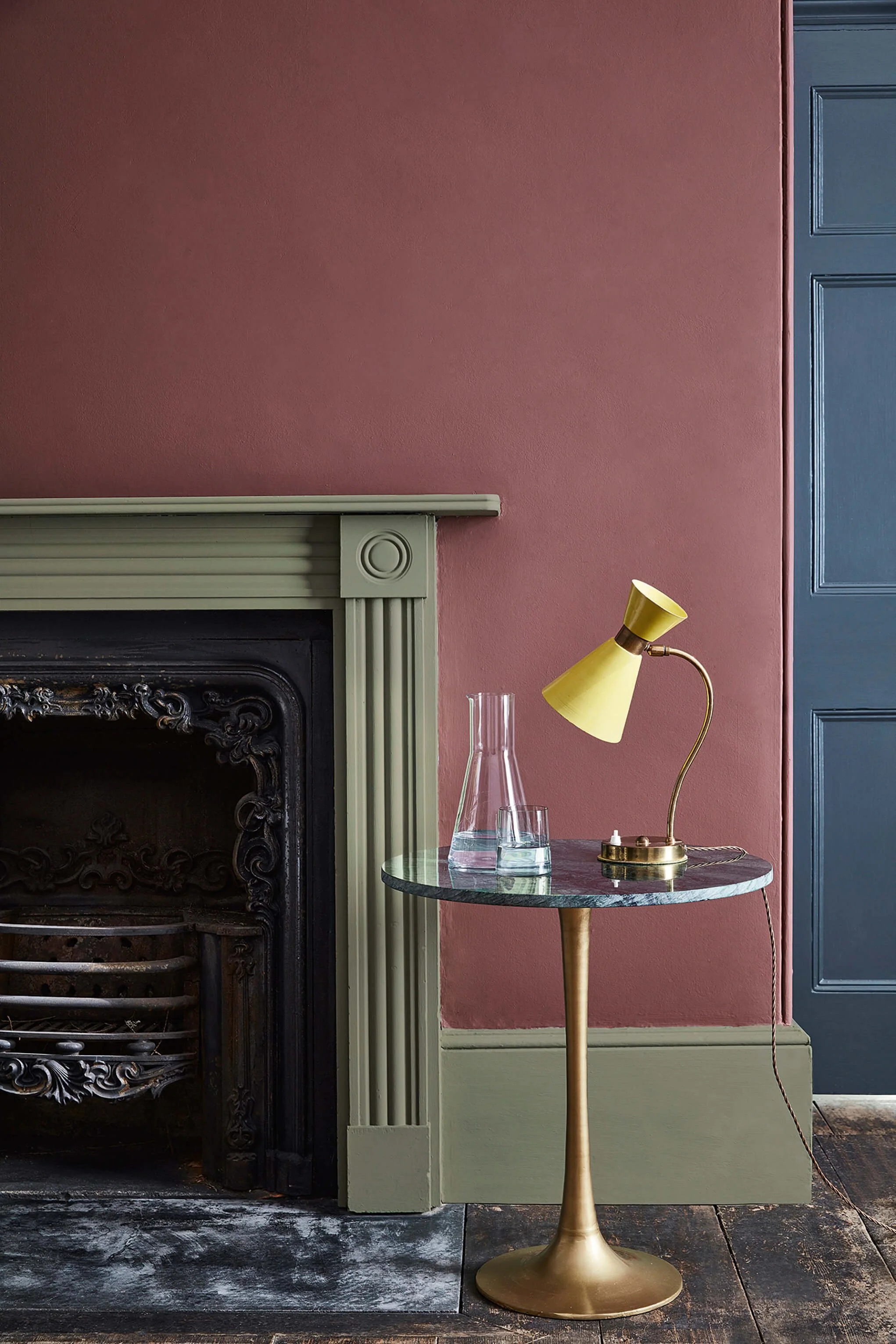
Image credit: Little Greene - Adventurer
My favourite paint brand, Little Greene, have also chosen a deep red as their colour of the year. Adventurer is a plum aubergine shade that works beautifully when paired with different shades of blue or sage green. I’ve just used this colour as an accent on a freestanding bath in a client’s design, alongside Celestial Blue on walls!
A warmer red that feels more terracotta, the Glidden 2026 colour of the year, Warm Mahogany, has a really uplifting feel. Colour drench the entire room for a warm enveloping effect or keep walls neutral and use it only on woodwork for a subtler splash of colour.
Earth colours
With a growing desire for calm and connection to nature, nature-inspired hues will be really popular this year, creating a grounded feel.

Image credit: Benjamin Moore - Silhouette on walls
Silhouette is Benjamin Moore's choice and it forms part of their lovely colour trends palette for 2026. Taking inspiration from the natural world, this rich espresso deep brown shade with charcoal undertones feels softer and more muted than last year's mocha and purple browns. The rest of the palette includes neutral shades like creamy white as well as muted earthy tones from the cool and warm sides of the colour spectrum. I love the combination of Silhouette with First Crush, Narangasett Green, Southwest Pottery and Sherwood Tan, as shown above.
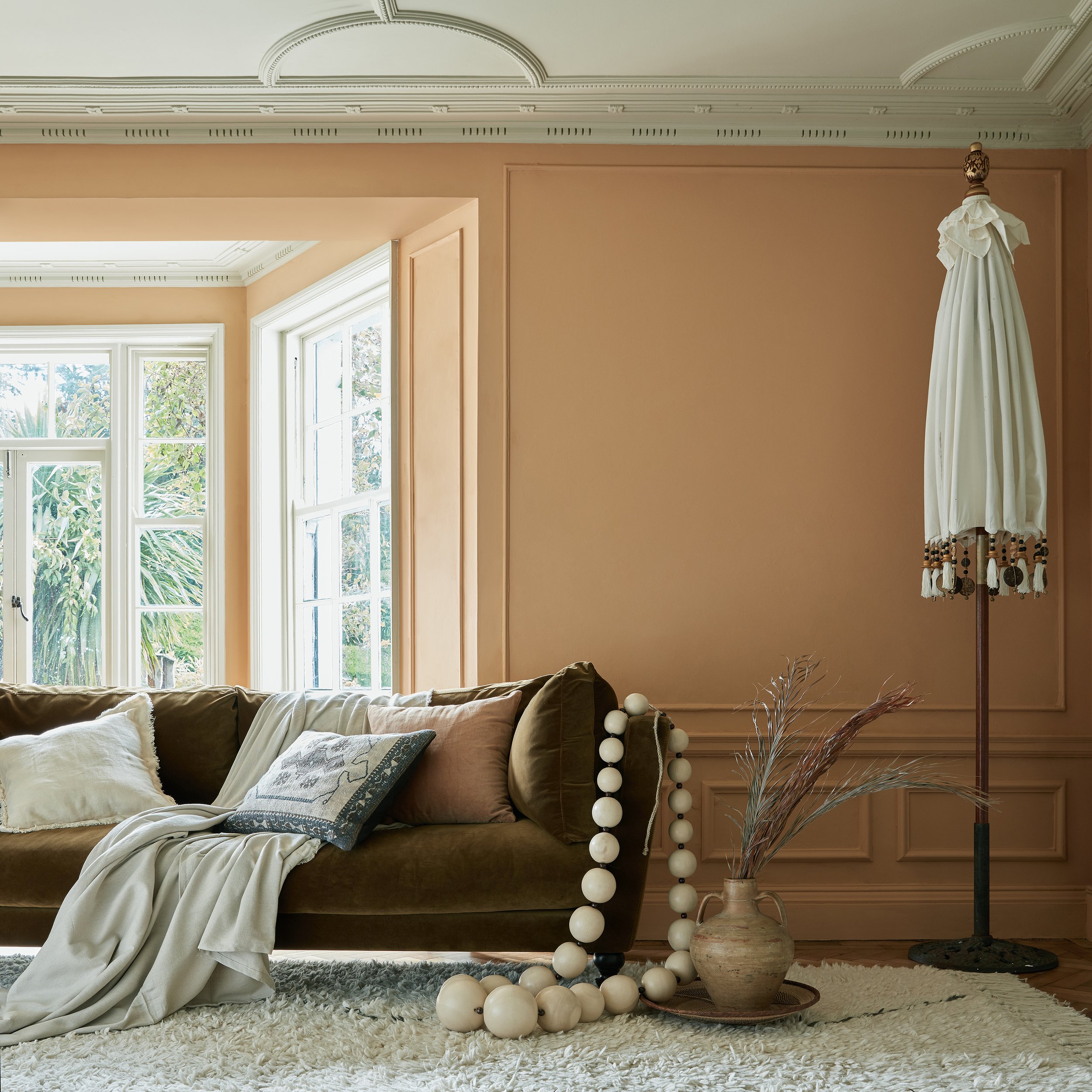
Image credit: Earthborn - Freckle
Described as "a naturally warming shade, rooted in nature", Earthborn's Freckle is a subdued orange, containing a blend of ochre and terracotta clays. It has a welcoming and comforting feel and would work equally well wrapped around the entire room or as an accent.
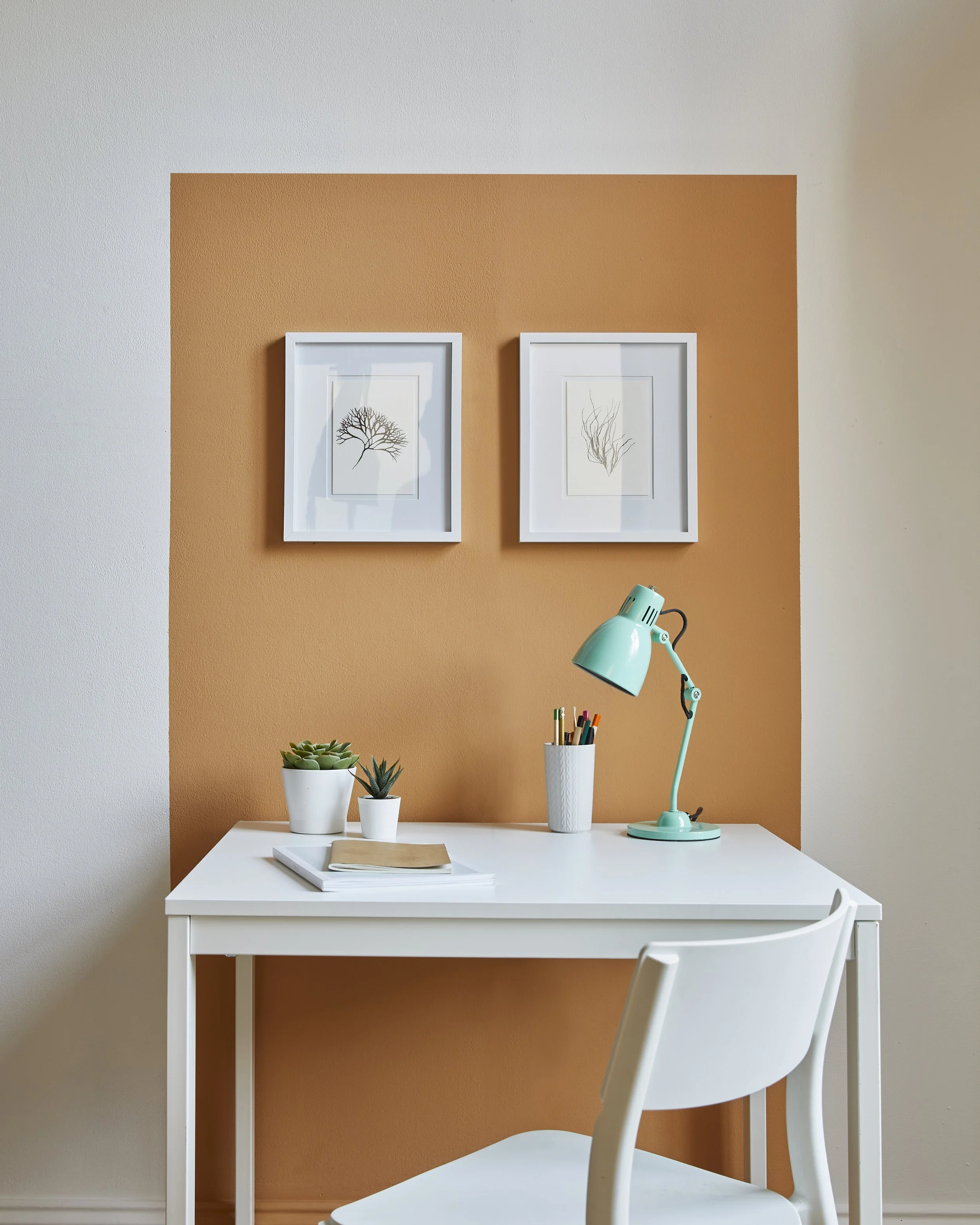
Image credit: Earthborn - Freckle
The perfect paint colour for zoning a small area of an open plan space, it feels uplifting without being too bright.
Blues and greens
A Rhythm of Blues
Image credit: Dulux - Rhythm of Blues
This year, Dulux has chosen not one but three paint colours - its Rhythm of Blues. This "versatile family of indigos" comprises of three different blue shades - Free Groove, Mellow Flow and Slow Swing. Choose just one or combine them to highlight architectural details or to zone a room. While I’m a great lover of blue and I like all of the shades, I would recommend including pops of warm colour (such as orange, ochre, gold and pink) for contrast and to prevent the space from feeling flat.
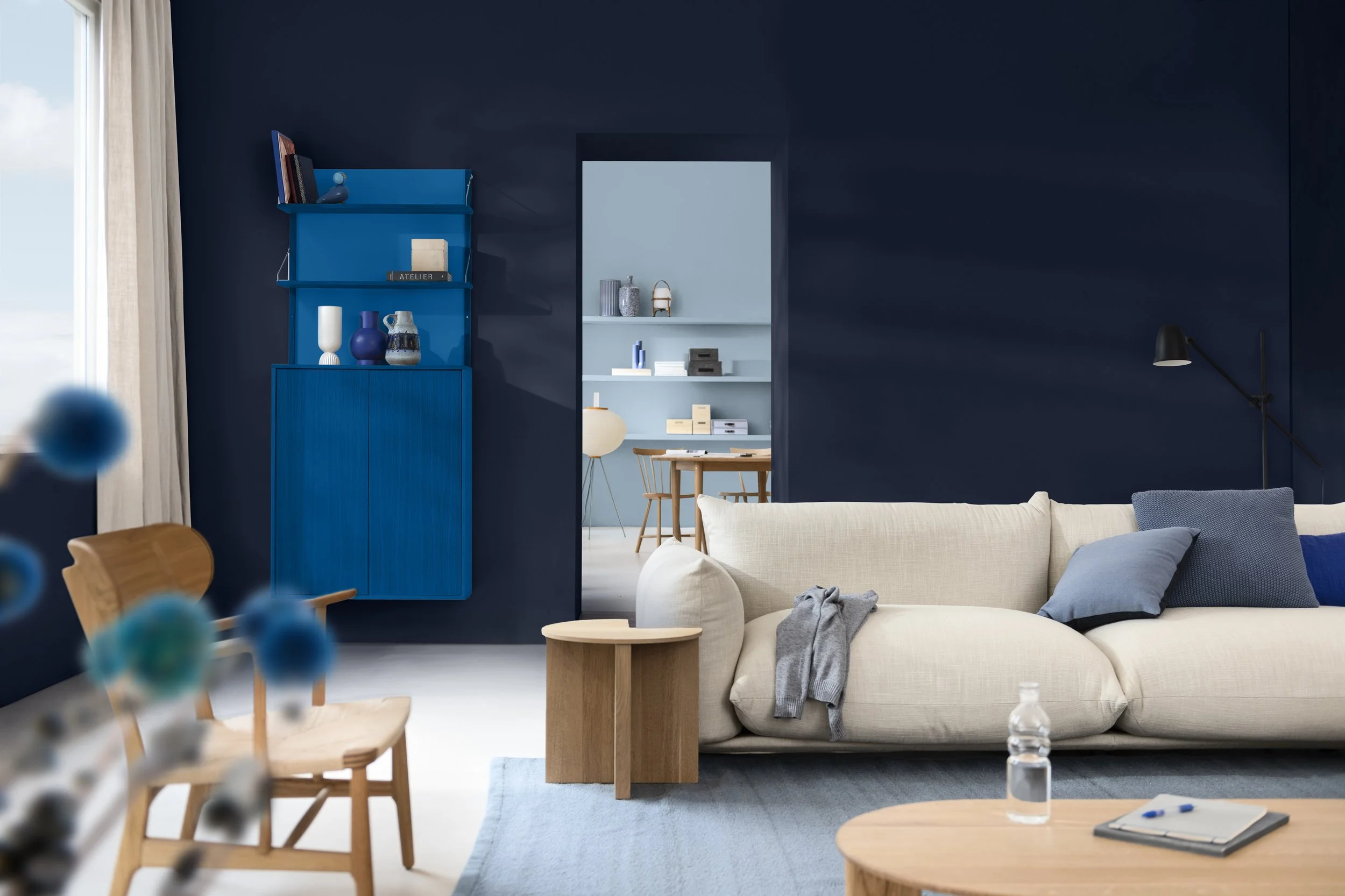
Image credit: Dulux - Rhythm of Blues
All three blue shades are included in three different colour collections and with bright, muted and neutral options, there's a palette for every mood. My favourite is the Flow palette, which includes taupe pink, terracotta and soft brown shades.
Earthy Greens
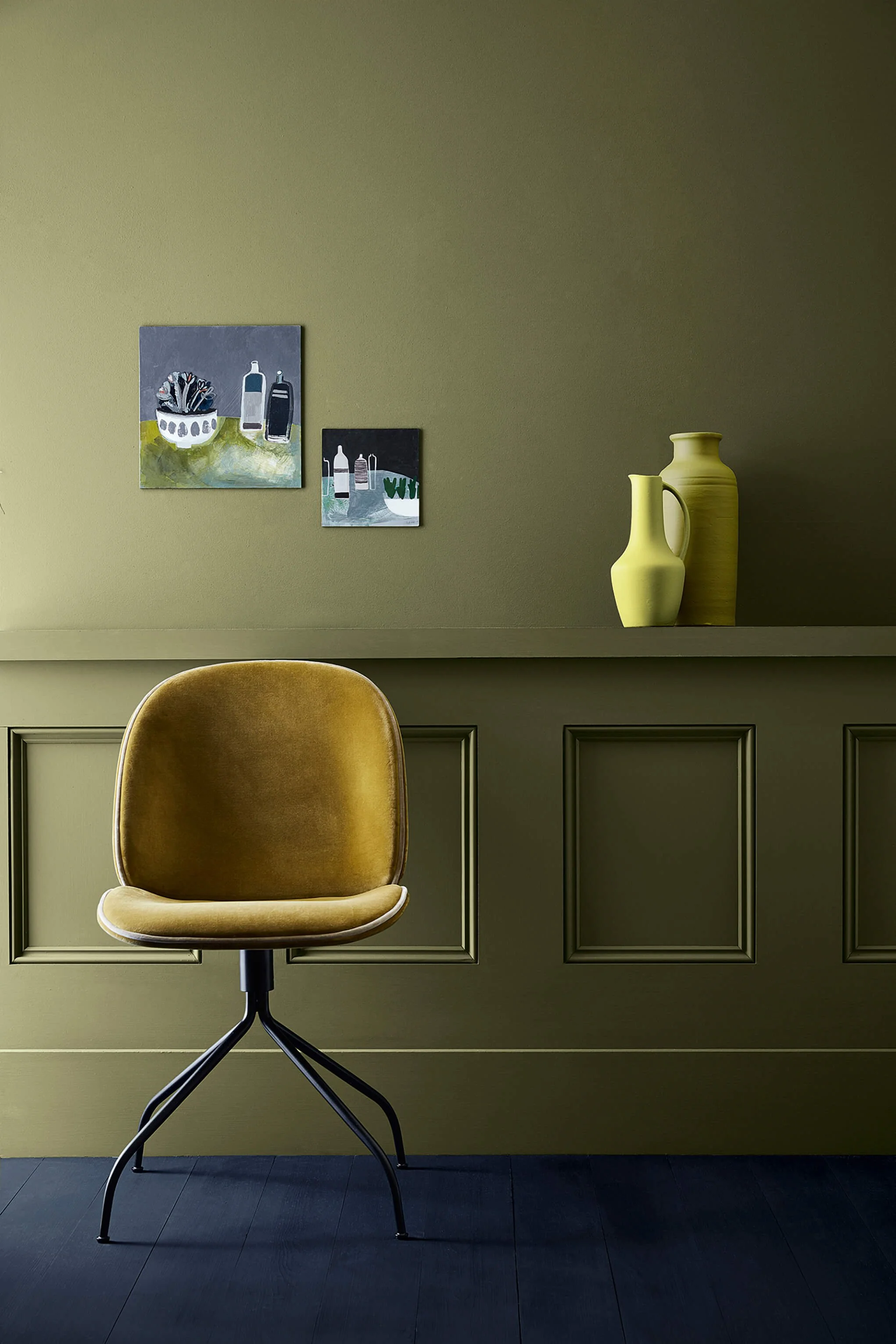
Image credit: Little Greene - Olive colour
Last year's rich olive greens with warm undertones will continue to be popular, along with lighter shades like Valspar's colour of the year, Warm Eucalyptus. This is a lovely shade for creating a calming serene feel in a bedroom, especially when combined with natural materials and warm wood tones.
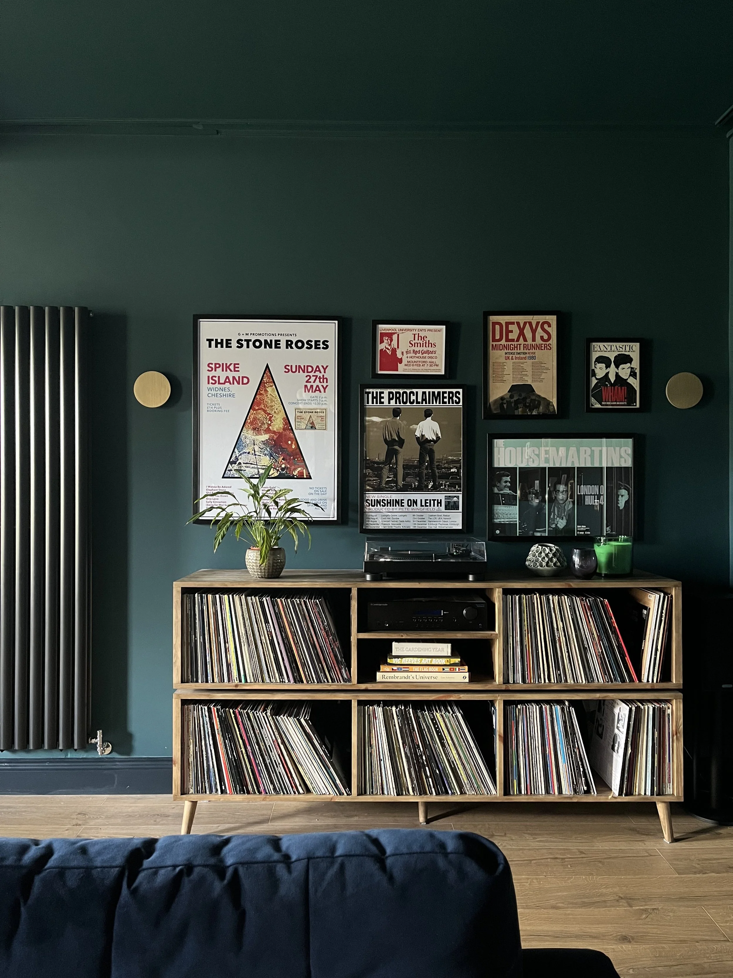
Teals

Image credit: Mylands Burlington Arcade / @thecountryhousediaries
Meeting in the middle of blue and green, we’ll be seeing saturated shades of teal this year. Mylands has chosen Burlington Arcade as their colour of the year - a moody hue that works wonderfully with mustard and other jewel tones such as amaethyst and emerald for a sumptuous look.
In this family basement project, we used Zoffany’s Serpentine on the walls and ceiling for a rich, luxury feel.
Behr’s choice, Hidden Gem is described as a smoky jade has a less saturated look for a softer feel - it looks teal or green depending on the time of day and natural light.
Warm neutrals
Pantone's colour of the year, Cloud Dancer, has caused a lot of disappointment in the world of design and for good reason. Neutrals aren't the most exciting of colours at the best of times but this one is a particularly boring shade of white. The less said about it the better.
Image credit: Lick - Taupe 03
On a more positive note, this year we'll be seeing much prettier and warmer neutrals with soft pink and warm taupe undertones, like Taupe 03 from Lick’s 2026 colour palette - the perfect backdrop for earthy greens and soft ochres.
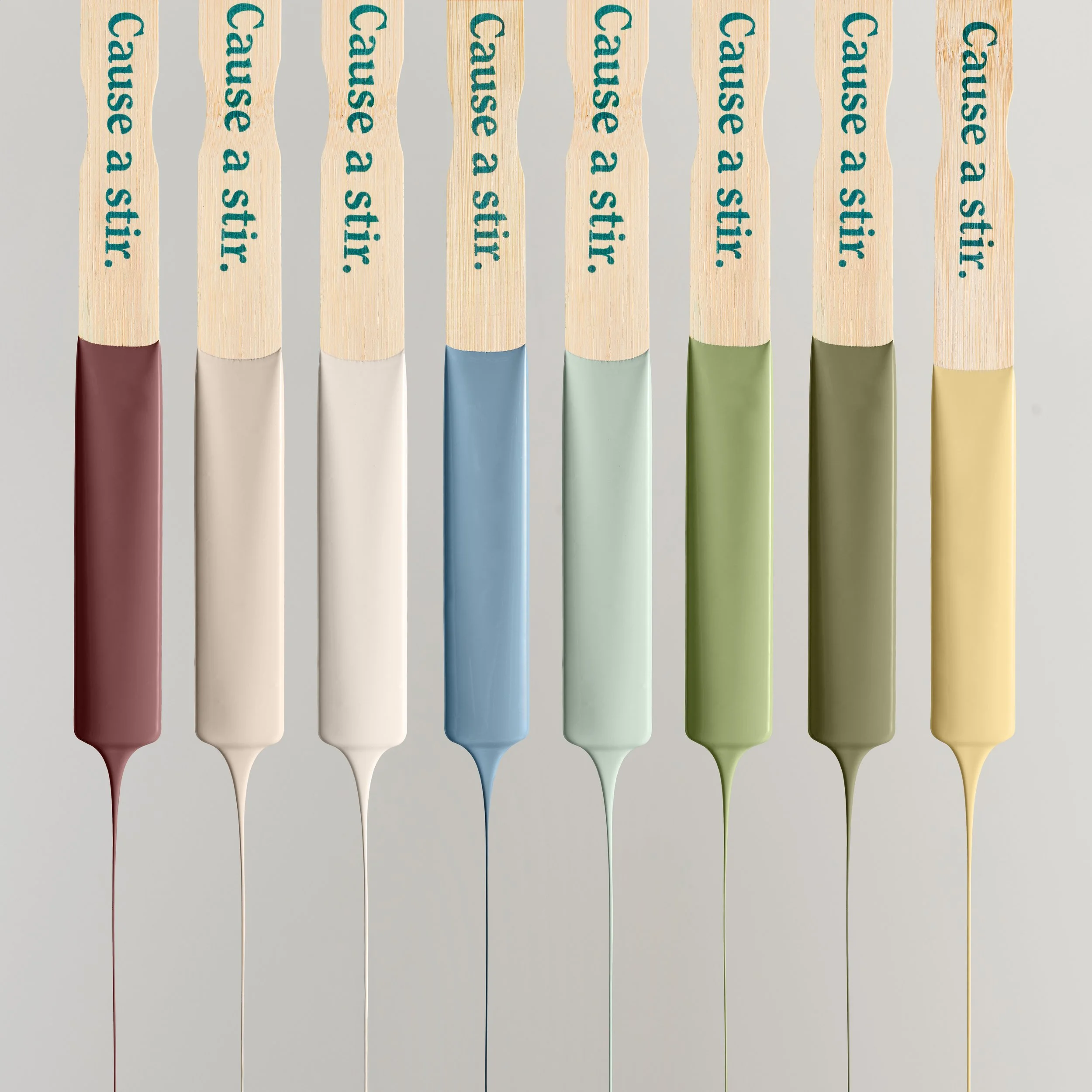
Image credit: Lick - 2026 colour palette
Lick’s palette actually perfectly captures this year’s paint colour trends. From mossy green and soft blue to muted ochre and wine red, it’s a beautiful collection guaranteed to bring happiness, calm, and personality to your home!
What do you think? Let me know in the comments! And if you need any help with choosing the perfect colours for your space, do get in touch.
RELATED POSTS