
The Best Paint Colours for an East Facing Room
Choosing paint colours can be a time consuming business and a room's orientation has a big impact on how colours appear. A few months ago, I wrote a blog post about the best colours for north facing rooms and today, I'm sharing my tried and tested paint colours for east facing spaces, from dark blues and greens to pale pinks and neutrals. It can be especially tricky to find the right colour for an east facing room because the light changes so much throughout the day. I recommend reading this blog post first where I share lots of tips on how to choose paint colours for your home.
When do you use the room?
Of course you need a paint colour that works in all of the different lights, but it's really helpful to focus on the time of day you spend the most time in the room and the kind of mood you want to create.
In the morning, an east facing room will be bathed in a golden glow. The warm tones of the direct light will feel lovely and soft and gentle (unlike in a west facing room at sunset where the light can feel intense). A warm paint colour will enhance the golden sunrise tones and make the whole room feel comforting and uplifting. On the other hand, a cool paint colour will make the gentle morning sun feel more balanced - perfect for creating a calm, peaceful feel.
Approaching midday, the light will become brighter and clearer with a lot of shadow, before becoming gradually cooler and flatter as it fades into the indirect light of the afternoon and evening. A warm paint colour will still feel comforting and inviting but with a slightly muted, less vibrant glow. A cool colour will appear softer and greyer for a peaceful and tranquil feel.
Neutrals

Warm neutrals with red or yellow undertones are the best option if you mainly use your east facing room in the evening. Neutrals with a green base can work well in the morning to balance the warm natural light but all of the below neutrals look good at all times of day.
Mayonnaise (Benjamin Moore) - A lovely warm white with a touch of creamy yellow.

Image credit: Benjamin Moore - Mayonnaise
Pebble Shore (Dulux) - a sandy, mid neutral with a touch of Khaki for a relaxing feel. It looks greyer in the afternoons, without feeling cold.

Kids’ room painted in Pebble Shore
Portland Stone (Little Greene) - one of my go-to neutrals, the Portland Stone family comes in four different shades ranging from Pale to Dark. It's a grey based neutral and works in rooms of any orientation.

Image credit: Little Greene - Portland Stone family
Oxford Stone (Farrow and Ball) - An earthy and rich taupe that feels warm and welcoming throughout the day.

Living room painted in Oxford Stone
Greens
Both cool and warm shades of green can work in an east facing space, depending on the time of day you use the room and the mood you're going for.
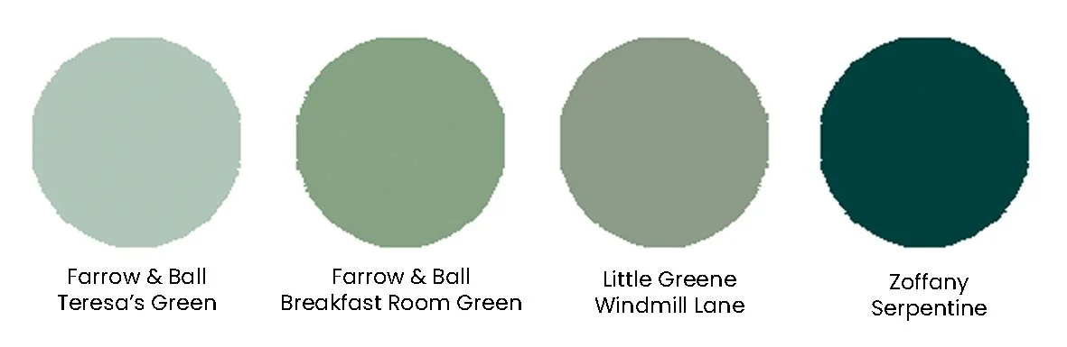
Teresa's Green (Farrow & Ball) - A lovely, refreshing shade of pale aqua with a rich blue base and soft green undertones. This pale green feels particularly calming and therapeutic in the cool afternoon light. Try adding small hits of bright colour like yellow in the accents.
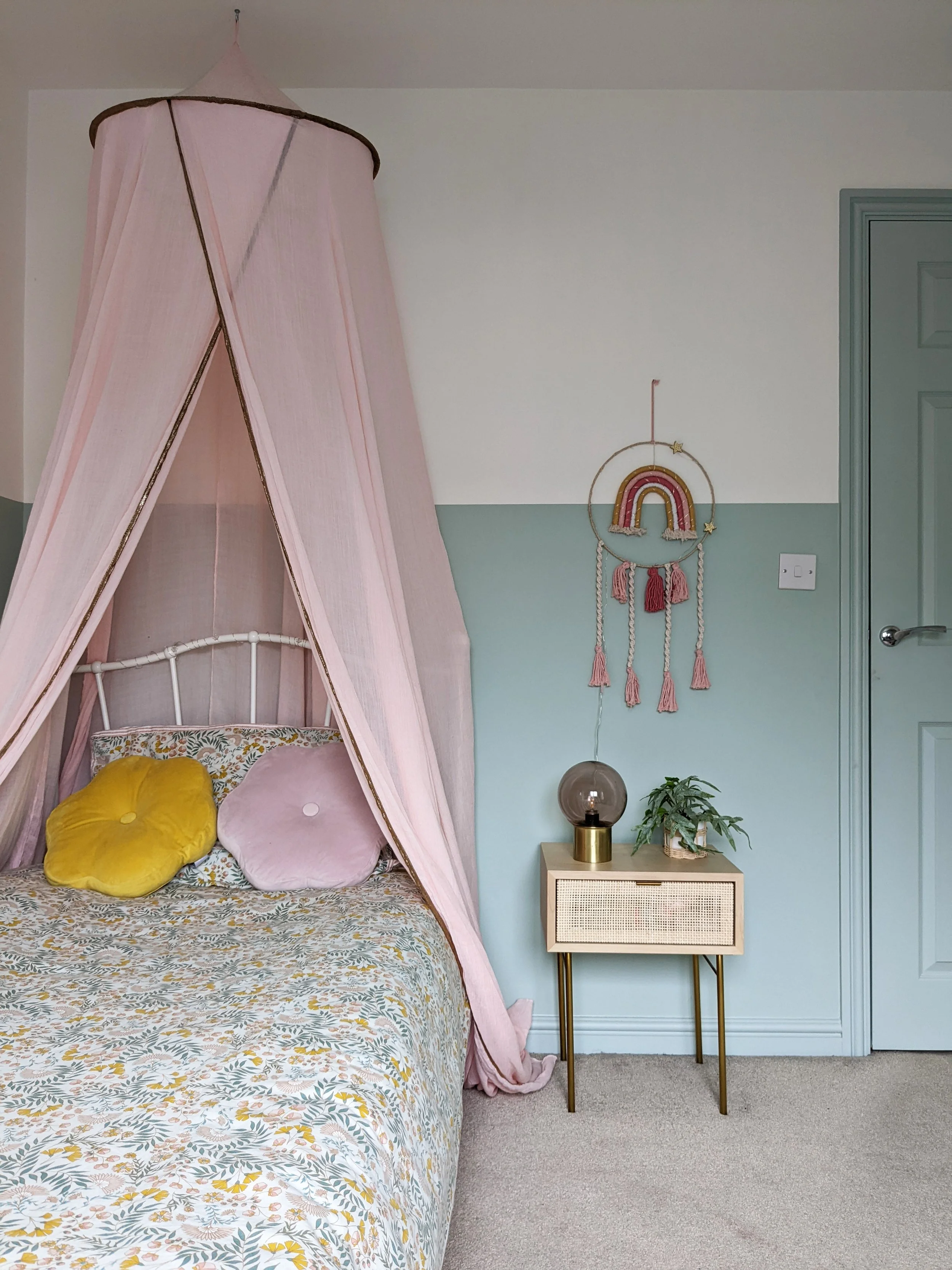
Girls’s room painted in Teresa’s Green and Wimborne White
Windmill Lane (Little Greene) - A muted, mid-tone green, this colour works beautifully in an east facing space at all times of day.

Hallway painted in Little Greene’s Windmill Lane
Breakfast Room Green (Farrow and Ball) - A cheerful, mid-tone green, evoking the freshness and optimism of early mornings. Named after traditional breakfast rooms which were usually east facing, it maintains a lively feel at all times of day.
Hallway painted in Breakfast Room Green (I can’t take credit for this lovely design - it’s all my mother-in-law’s work!)
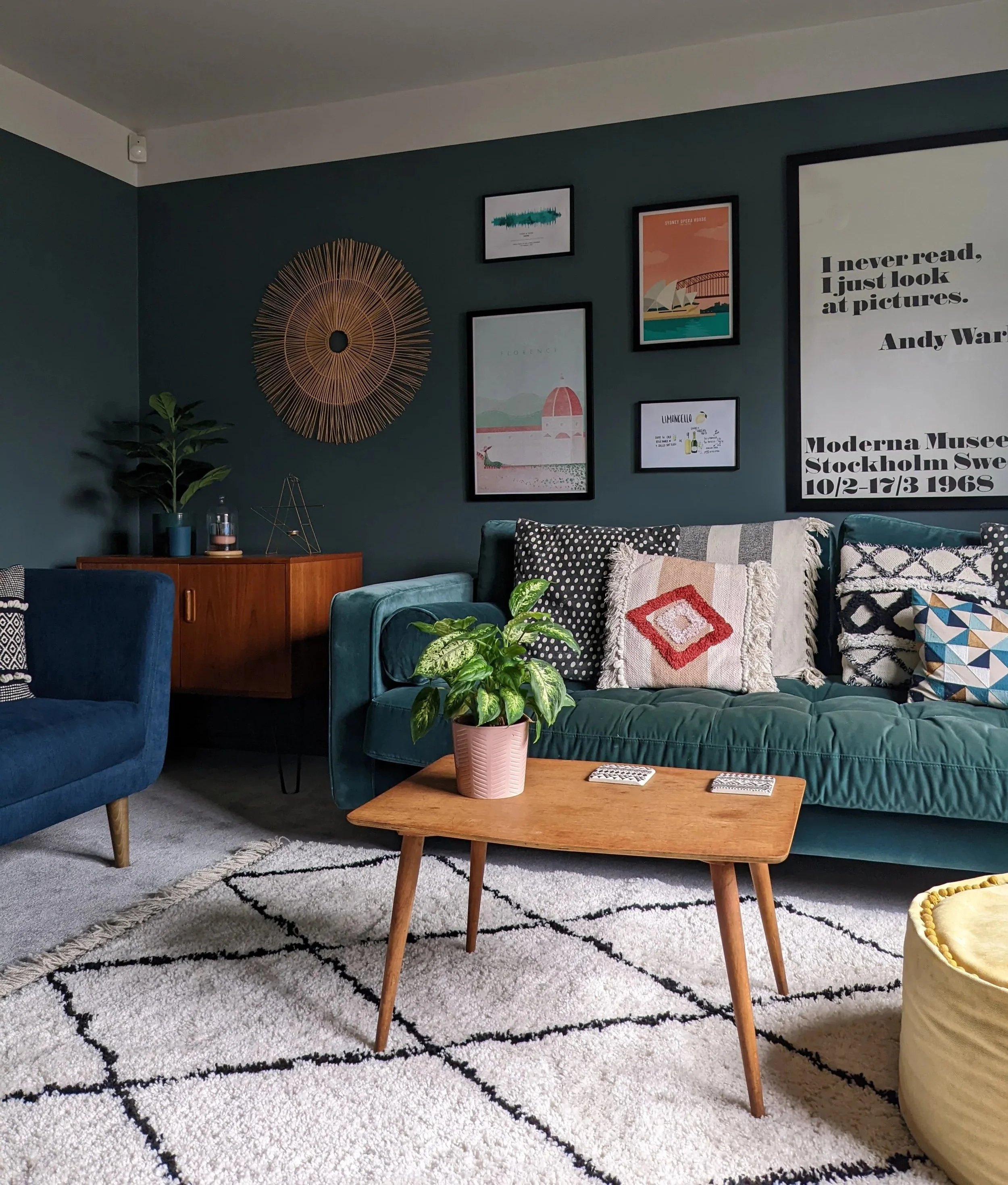
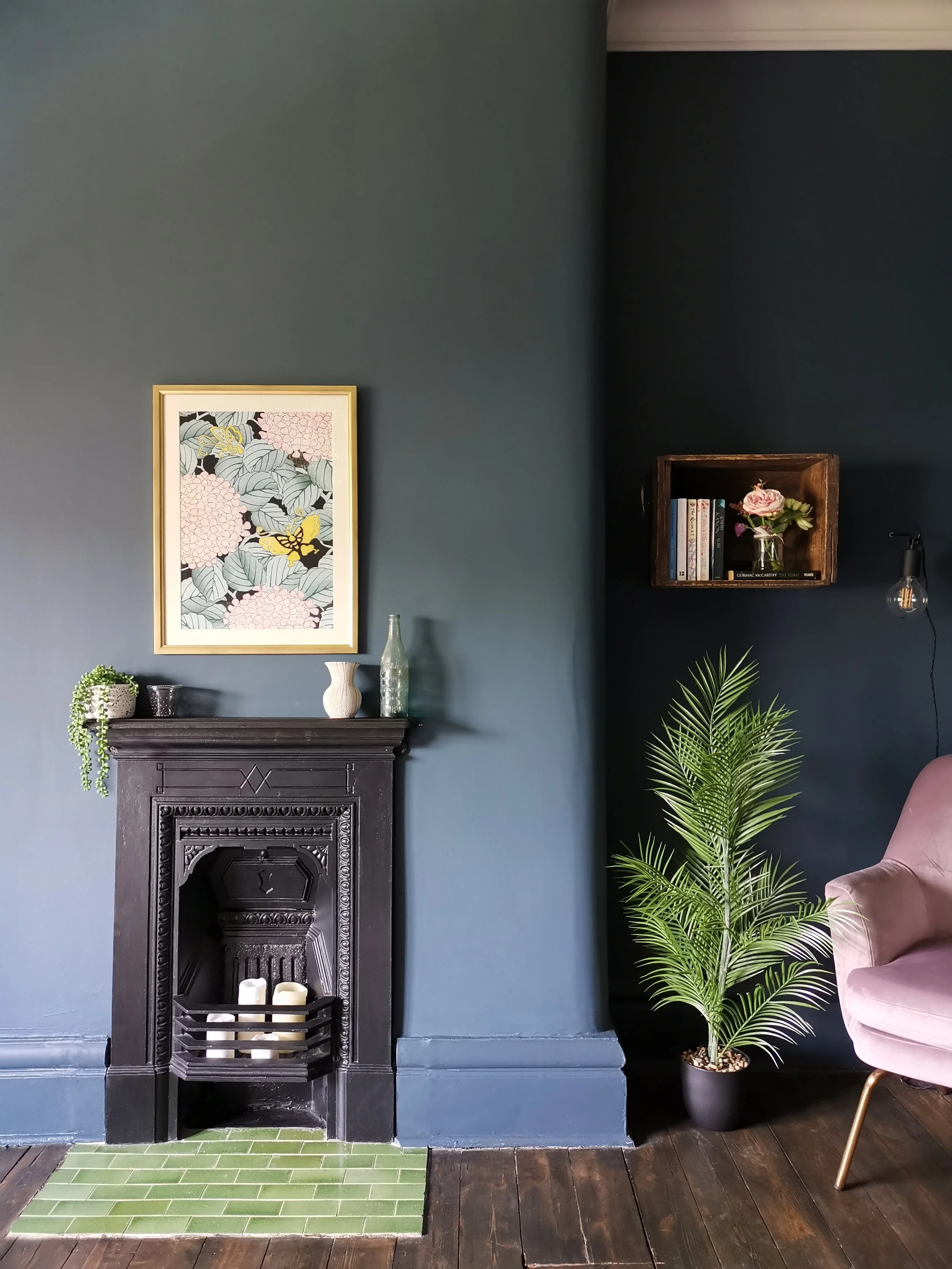
Serpentine (Zoffany) - A lovely rich dark green with a big dose of blue for a cocooning, intimate atmosphere. It feels noticeably more vibrant in the soft morning light of an east-facing room. I love this colour!
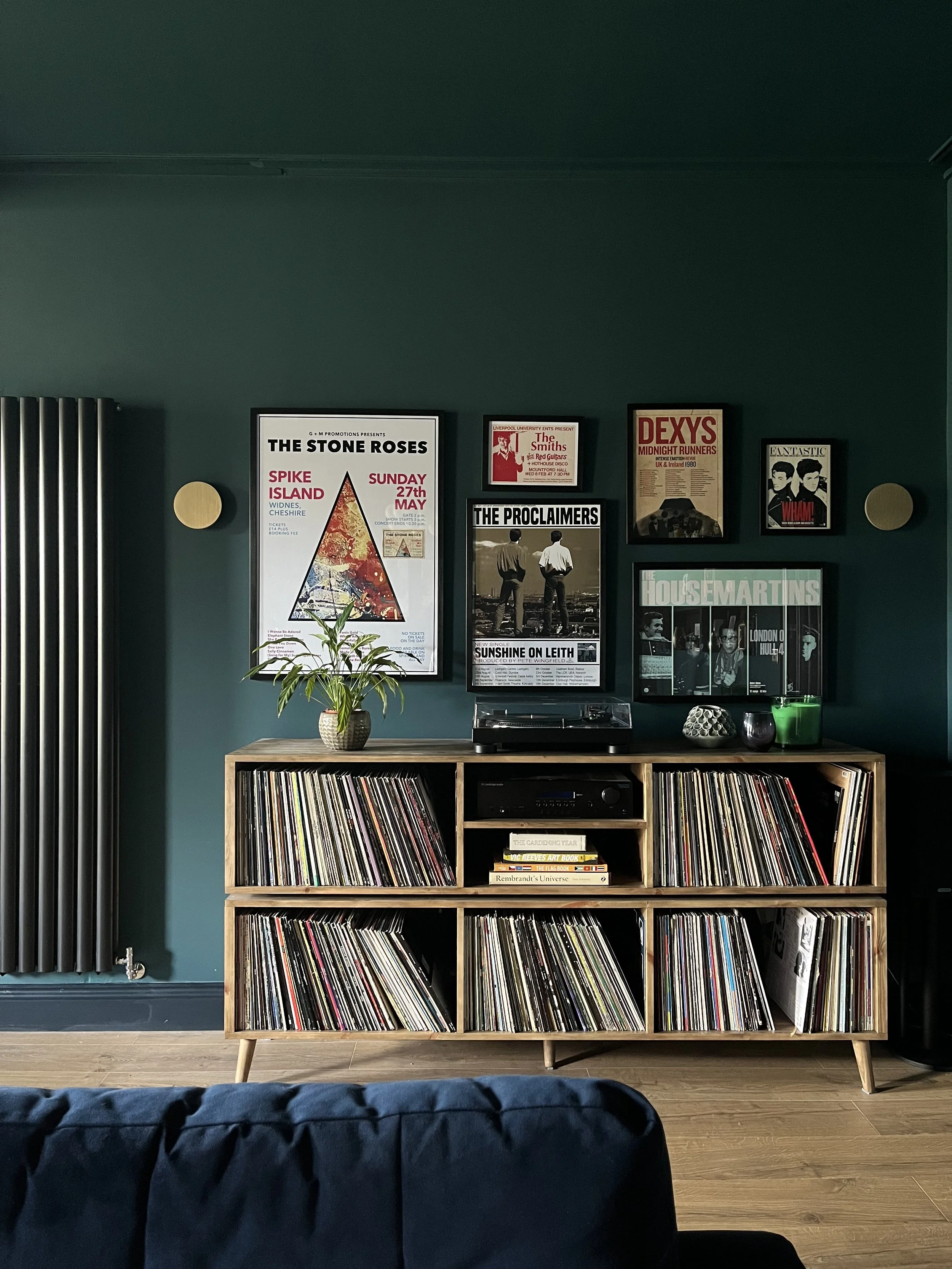
Open plan family room painted in Zoffany’s Serpentine
Blues
Cool shades of light blue can feel too cold in the afternoon light so make sure you choose one with a green undertone. Going dark for an enveloping feel is also a great option for a living room or a bedroom that you mainly use in the evenings.
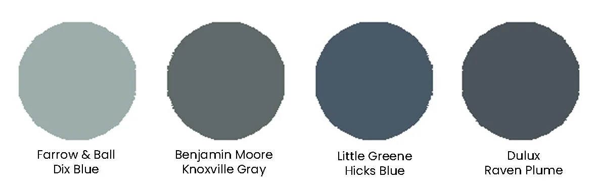
Dix Blue (Farrow & Ball) - A soft, muted blue with green undertones, creating a serene and inviting atmosphere. It balances the warm morning light and has a softer, calmer feel in the afternoon.
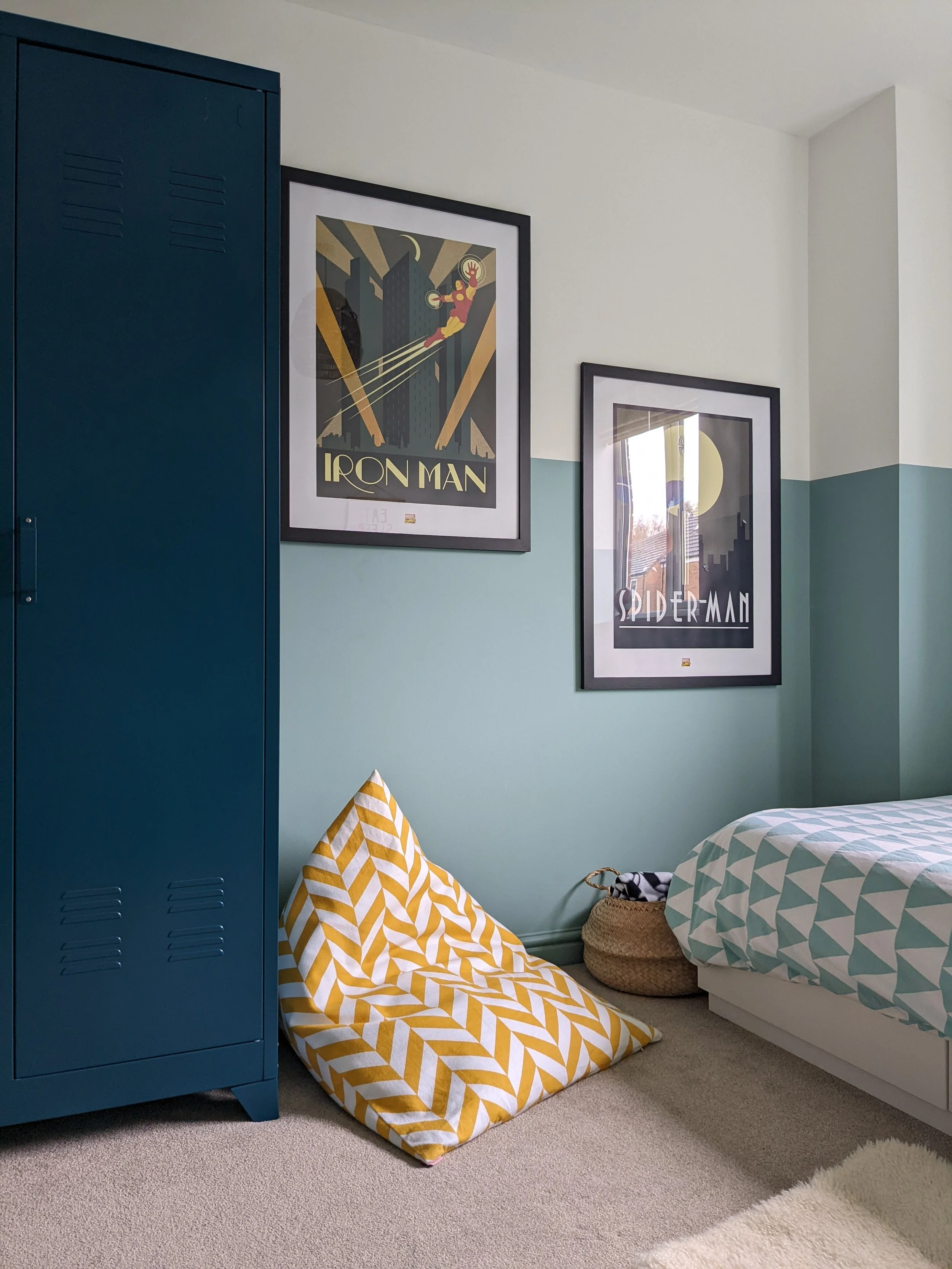
Boy’s room painted in Dix Blue and Wimborne White
Knoxville Gray (Benjamin Moore) - sitting somewhere between blue and grey, with a hint of green, this is the perfect paint colour for a cocooning, comforting feel.
New build living room painted in Knoxville Gray
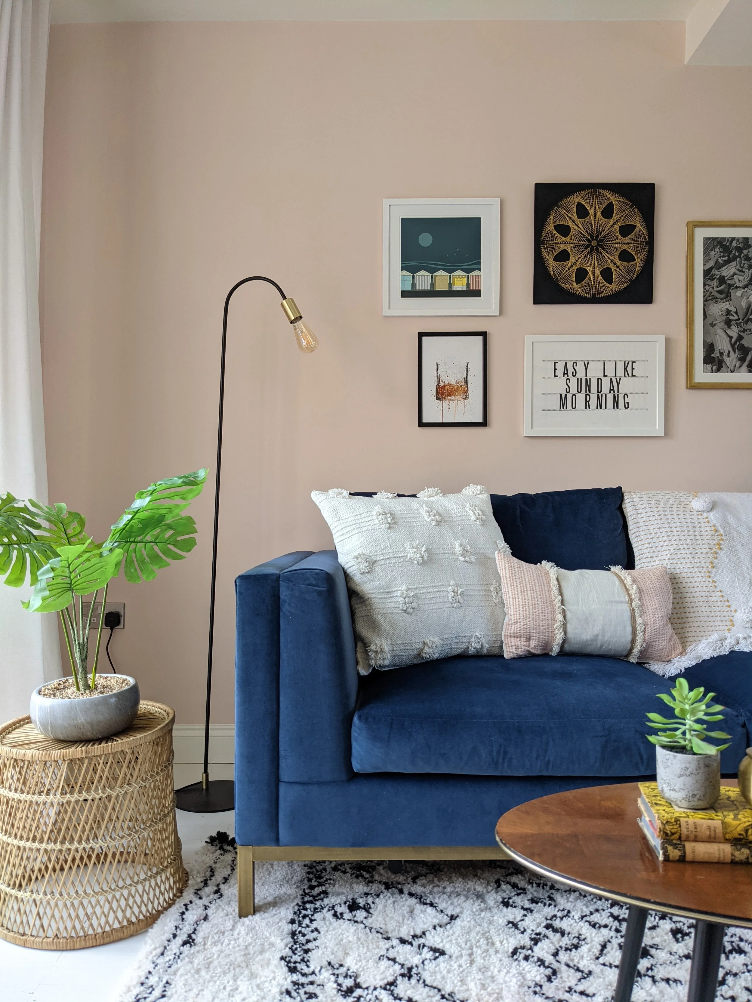
Hicks Blue (Little Greene) - A deep inky blue, creating a dramatic and enveloping cocoon.
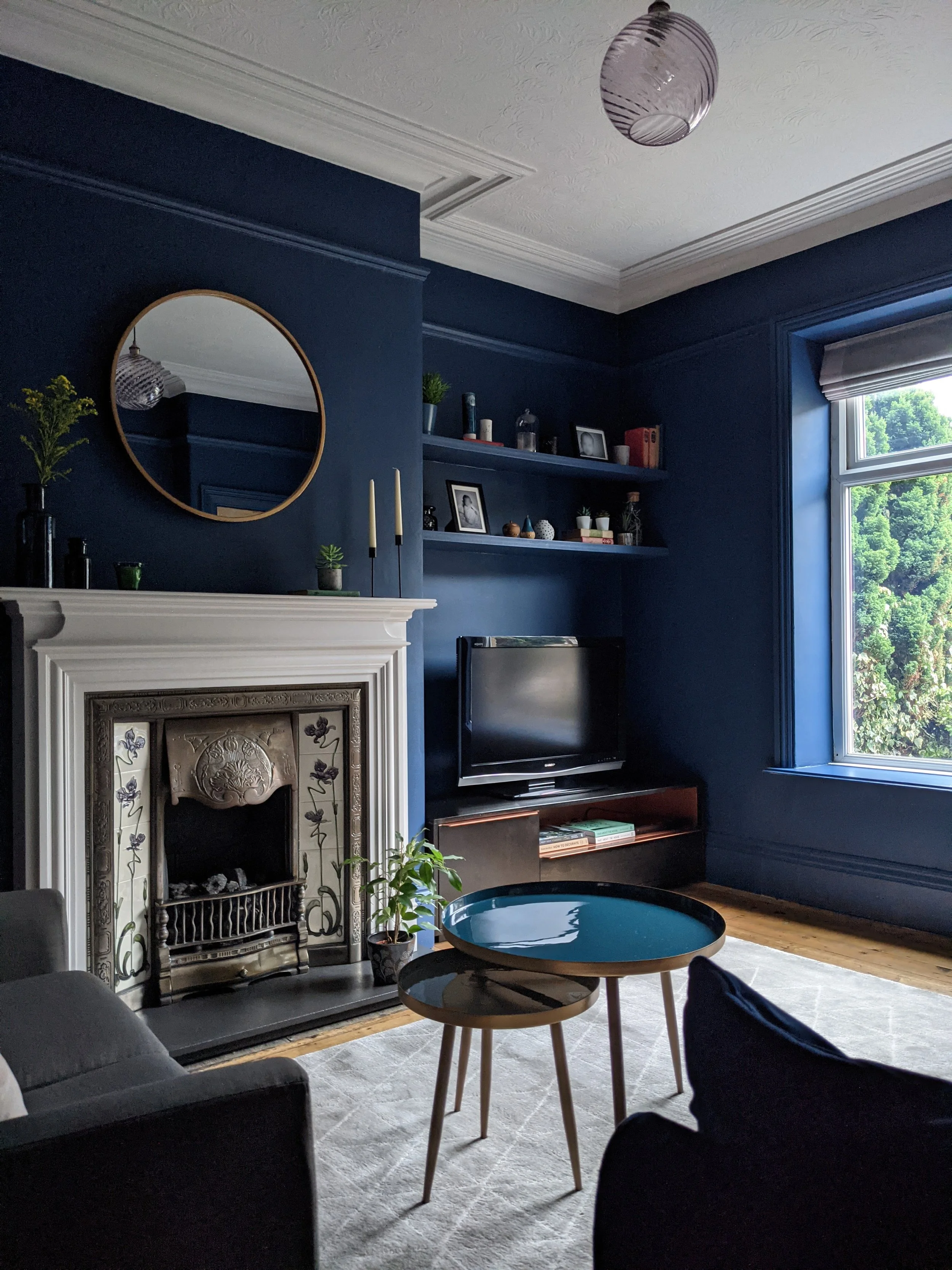
Victorian living room painted in Hicks Blue
Raven Plume (Dulux) - Definitely more muted than Hicks Blue, this dusky dark blue has subtle grey undertones - perfect for relaxation. It has depth but doesn't feel overpowering.
Edwardian bedroom painted in Raven Plume
Yellow

The warm light in the morning will make a yellow room feel vibrant and energetic - the perfect choice for a sunny dining room or a cheerful kitchen where you want to start the day feeling happy and motivated.
Sudbury yellow (Farrow & Ball) - a soft mid yellow. Not so bright that it will feel blinding in the morning's direct sunlight, but definitely softer in the afternoon.
Sunlight (Little Greene) - less vibrant than Sudbury yellow, this soft, buttery yellow has a gentler warmth that feels positive and uplifting.
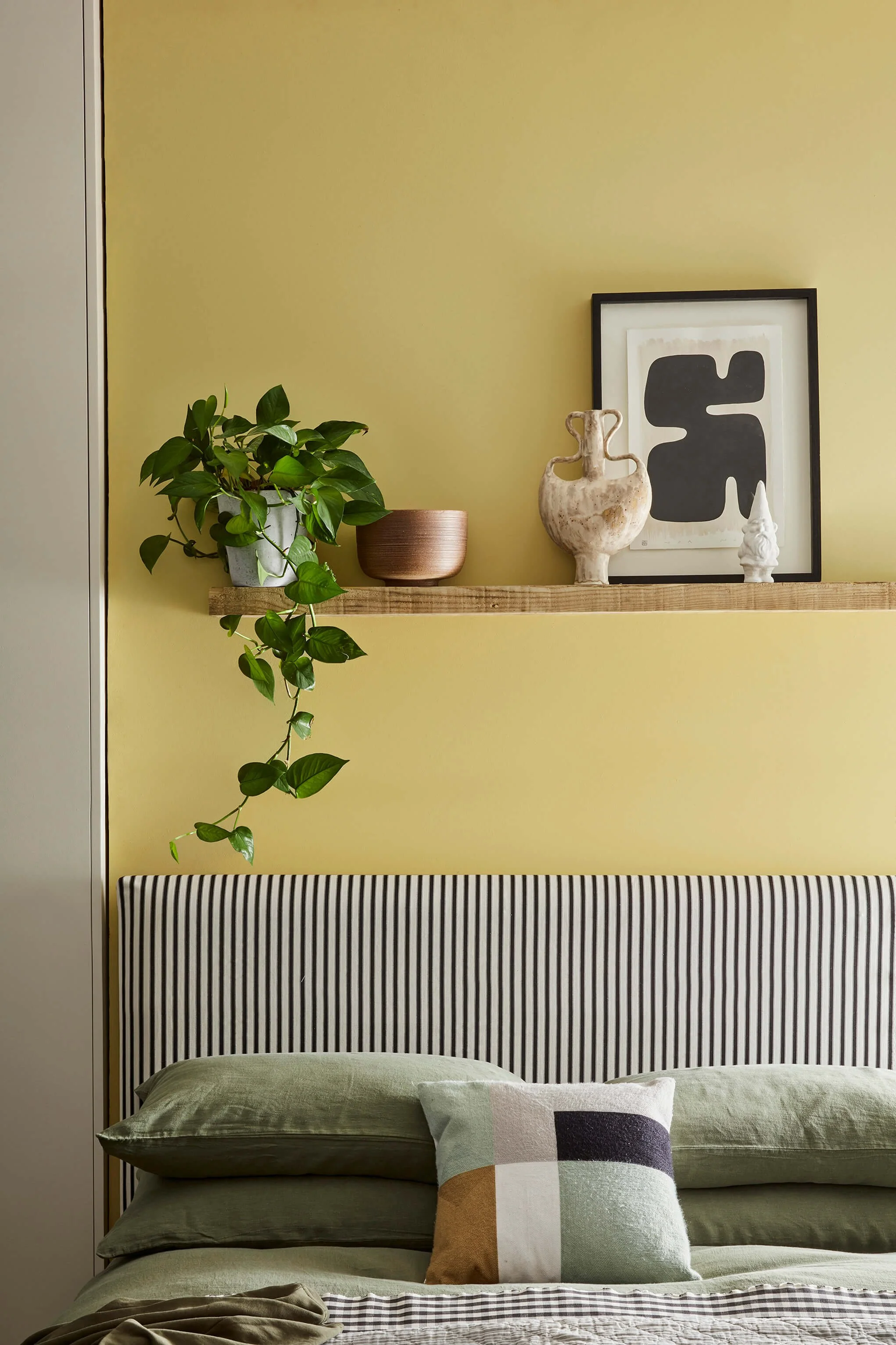
Image credit: Little Greene - Sunlight
Pinks and reds
Soft, muted pinks with warm undertones and earthy reds work beautifully in east facing rooms. Just bear in mind that they will feel more vibrant in the morning light. And be careful with pinks that have cool undertones - they have a tendency to appear lilac later in the day.
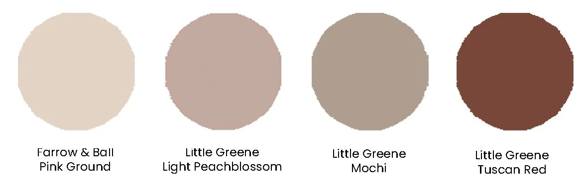
Pink Ground (Farrow & Ball) - a soft, muted pink with warm, earthy undertones. In east-facing rooms, the morning light enhances its gentle glow, making it feel both cheerful and calming. It's more muted later in the day but still feels uplifting.
Coastal living room painted in Pink Ground
Light Peachblossom (Little Greene) - a gentle dusky pink paint, with just the right amount of warmth to prevent it from looking lilac later in the afternoon. A great choice if you're after a slightly cooler pink.
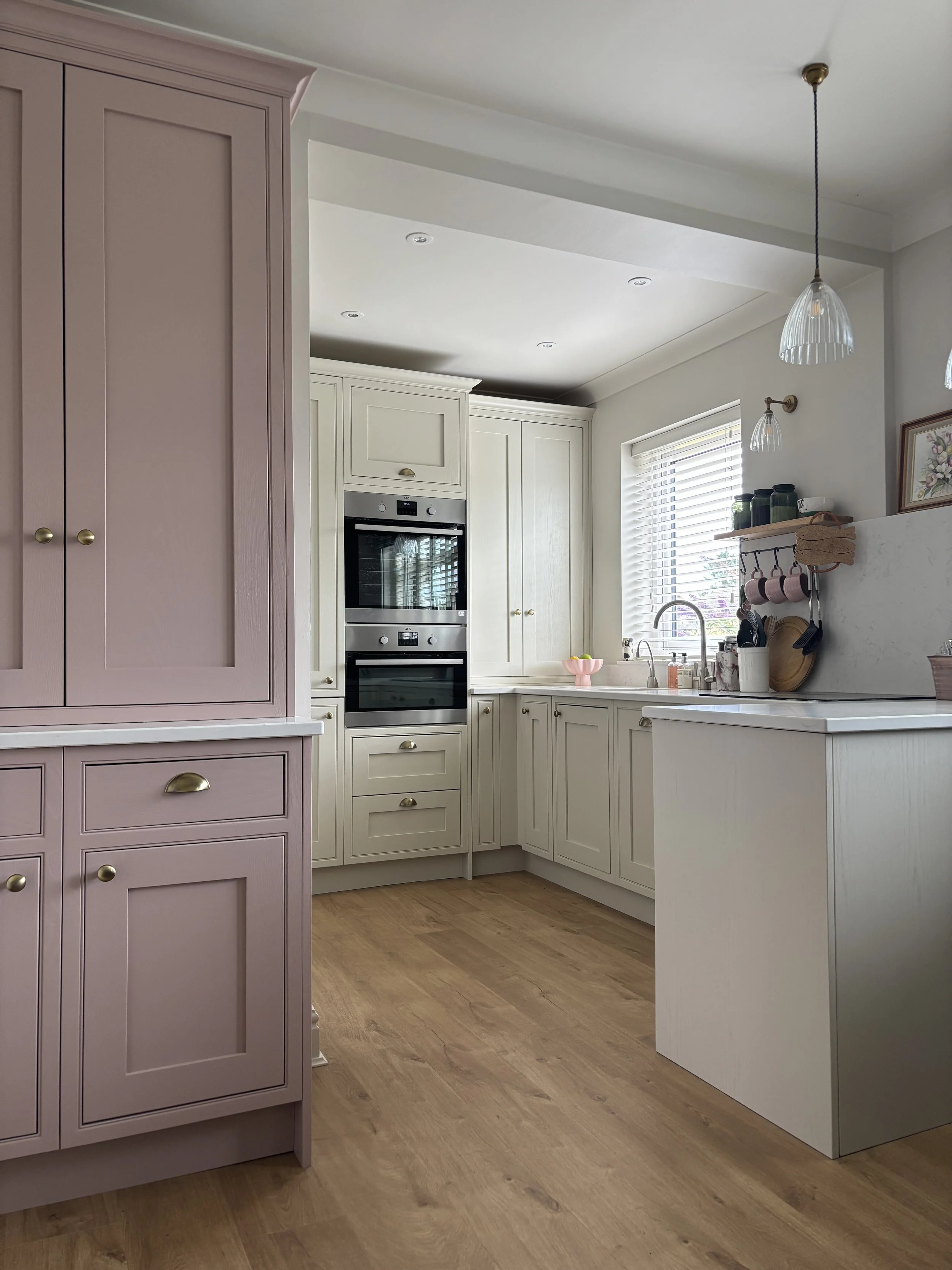
East facing kitchen, with pantry unit in Light Peachblossom. Walls & ceiling in Portland Stone Light
Mochi (Little Greene) - one of my go-to paint shades of the moment, Mochi is a beautiful pink brown that's both deep and muted with a lovely softness. It works especially well with dark wood tones.
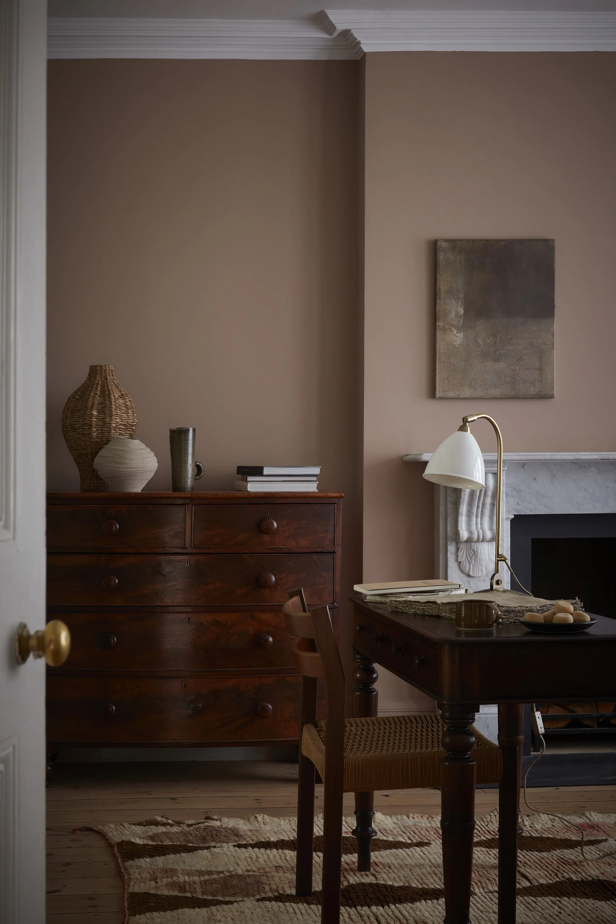
Image credit: Little Greene - Mochi
Tuscan Red (Little Greene) - a warm earthy red that feels rich and inviting. In an east-facing room, the morning light creates a vibrant, sunkissed effect but it maintains its warmth at all times of day. While it might feel a little too much all over, it works great as an accent - try wrapping it around the bottom half of the walls.
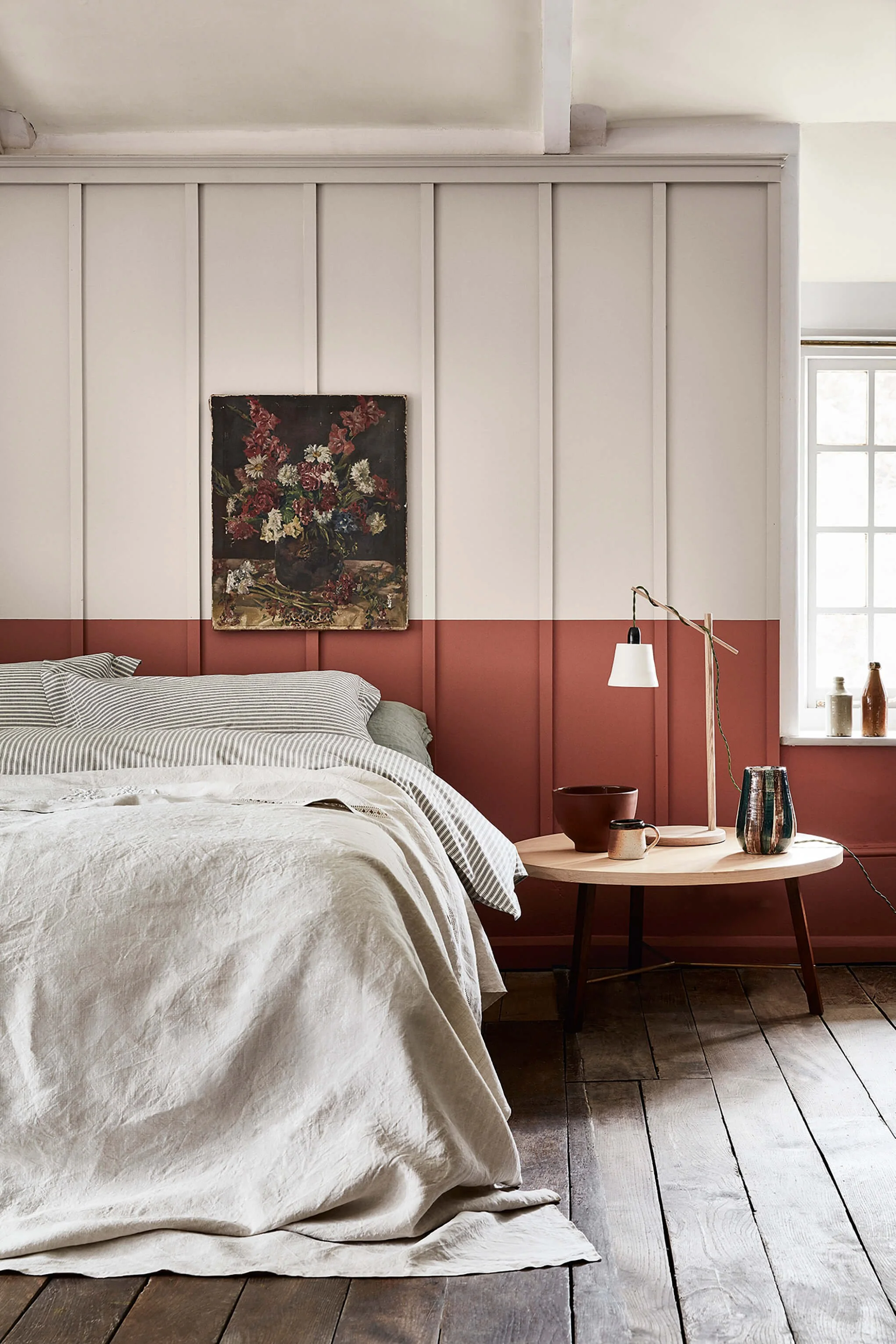
Image credit: Little Greene Tuscan Red and French Grey
Or why not paint the ceiling!
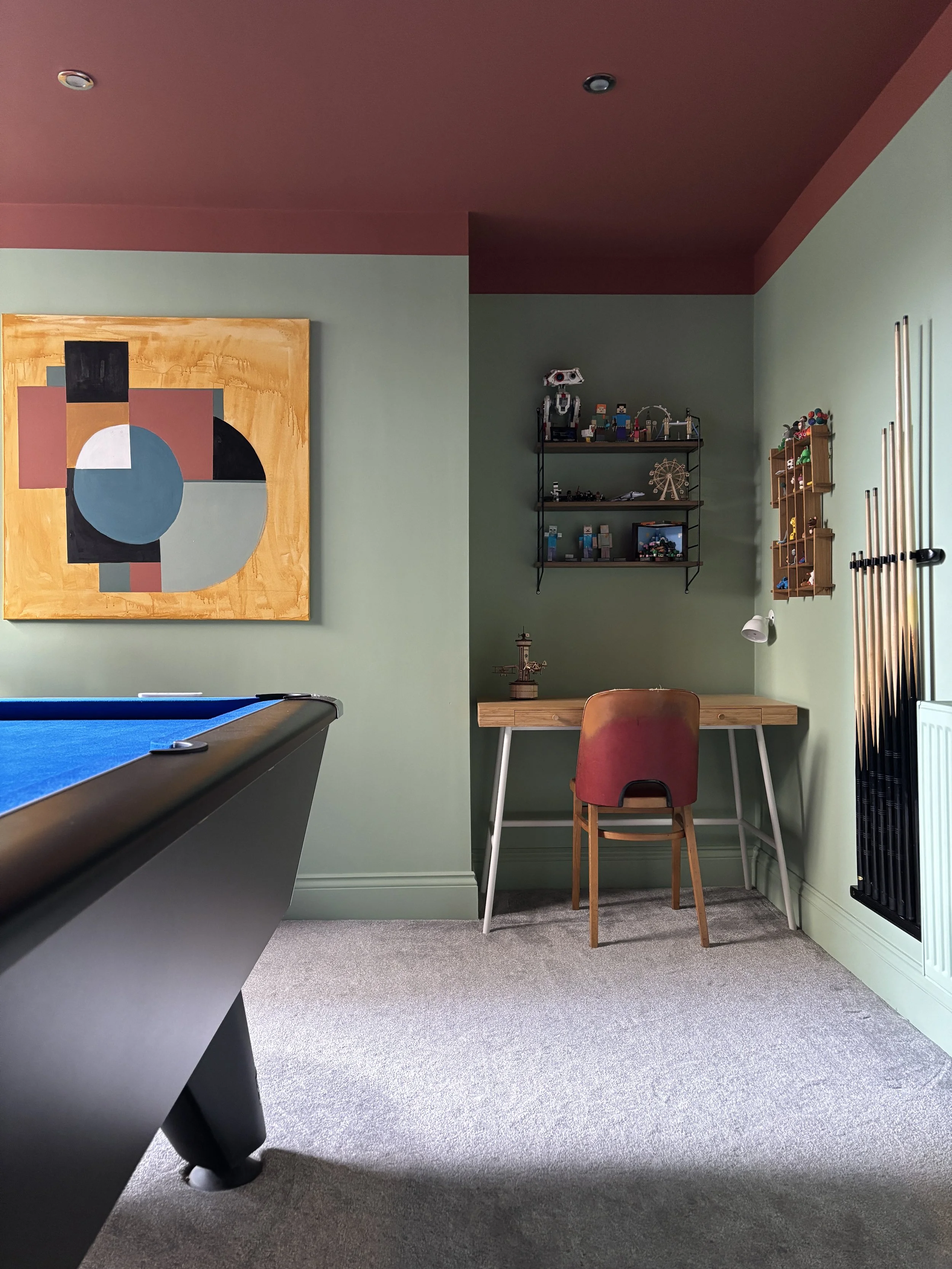
Our games room with walls in Pea Green and ceiling in Tuscan Red
And just a couple more very important tips:
As always, make sure that you try a sample in the space. Paint it on to a piece of lining paper (at least size A3) and see how it looks in different areas of the room at varying times of day and in artificial light.
If you opt for a cool colour scheme with blue, green or grey on the walls, make sure that you add warm accessories, warm wood textures and/or brass accents to give things a lift. Using the same accent colours throughout your home can help to create a cohesive look.
I’m a West Yorkshire based interior designer and I provide online design services throughout the UK. If you’re starting a project and would like some help, I’d love to hear from you! Take a look at my online interior design packages and get in touch if you’d like to book a free introductory call.